SVG Text Issues — Sydney 2016
Last updated 5 February 2016
Introduction
- General philosophy: How does SVG text interact with CSS.
- Baselines
- Auto-wrapped text
- Where does text wrapping start.
- What is done with over-flowed text.
- Doughnut holes.
- Multiple shapes.
General philosophy: How does SVG text interact with CSS?
Background
The main goal is to provide a way where CSS (HTML) text layout can be easily adapted to SVG so that browser vendors do not need to implement two layout models while at the same time not making text layout overly complicated in stand-alone SVG renderers.
Basic HTML/CSS text:
<p>Some text.</p>
Basic SVG text:
<text x="100" y="100">Some text.</text>
The difference in these models is that the HTML/CSS text is positioned at rendering time based on other elements in the HTML. The SVG text is given a fixed position that is independent of other elements.
Things get a bit more complicated when wrapping text into a given shape:
Wrapped HTML/CSS text:
	<style>
	  .wrapper { shape-inside: xxx; ... }
	  .float-left { shape-outside: yyy; ... }
	  .float-right { shape-outside: zzz; ... }
	</style>
	<div id="wrapper">
	  <div id="float-left"/>
	  <div id="float-right"/>
	  <p>
	    Some text.
	  </p>
	</div>

Wrapped text in HTML. One starts with a wrapper <div>. The 'shape-inside' property on this <div> reduces the wrapping area to the circle. Two floats <div>s are defined, one on the left (green rectangle) and right (red rectangle). The area that the floats exclude is reduced by the half-ellipses defined by the 'shape-outside' property. The final wrapping area is the light blue shape.
Wrapped SVG text:
	<style>
	  .my_text { shape-inside: xxx; shape-outside: yyy, zzz; ... }
	</style>
	<text id="my_text">Some text.</text>
	</div>

Wrapped text in SVG. One starts with a <text> element. The 'shape-inside' property on this element defines the wrapping area. The 'shape-outside' property reduces the wrapping area. The final wrapping area is the light blue shape. (*For SVG, is it possible to allow 'shape-outside' to have a list of shapes?)
The end result of both HTML/CSS and SVG/CSS is an identical wrapping area.
Difference of opinion?
- Tav: SVG Text uses CSS, SVG Text is not CSS text.
- Cameron: SVG text is CSS text.
The principle difference is where does CSS layout take over. I (Tav) believe that the proper place is in providing CSS layout a "wrapping area" that CSS text layout then fills. Cameron, I think, believes in starting a layer up with a CSS box (as created by a <div>), requiring, for example, explicitly specifying that box margins are zero.
I see this as an implementation issue. It may be necessary that for browsers to take advantage of the CSS layout engine, they need to create a CSS box, set box margins to zero, etc. but it should not be a fundamental part of the specification. Stand-alone SVG renderers should not need to deal with this extra level of complexity.
Amelia comments that "the CSS 'block' model layout does not apply to SVG; SVG layout defines the content box." But the "CSS inline box layout does apply" to auto-wrapped text which means we do need to address margins/padding/borders to the extent that they apply to inline boxes.
Baselines
Relevant specifications:
'dominanant-baseline'
Test

Test of 'dominant-baseline'. SVG. Reference PNG.
Missing values
SVG 1.1 'dominant-baseline' is based on the XSL 'dominant-baseline'. It includes additional values than currently in CSS Inline:
- 'use-script'
- 'no-change'
- 'reset-size'
- 'ideographic'
- 'middle'
- 'text-after-edge'
- 'text-before-edge'
I'm not too worried about losing 'use-script' and 'no-change' but I think 'ideographic' and 'middle' should be kept. Both are supported by Firefox and Blink. 'reset-size' also has a useful purpose (see next point).
Baseline table
In both SVG 1.1 and XSL the baseline tables are not changed when the font size changes. The tables are only changed when the 'dominant-baseline' has a value of 'reset-size'. It's not clear that this is the prescribed behavior in the CSS Inline spec and browsers don't seem to follow this.

Figure from the XSL 1.1 specification showing the default behavior upon 'font-size' change. The baseline table does not change.
'auto' values
The 'auto' value for vertical text when coupled with the obsolete SVG 'glyph-orientation-vertical' values '90deg' and '90' breaks SVG content. This is because these values for 'glyph-orientation-vertical' are mapped to the 'text-orientation' value 'sideways' which dictates that the 'dominant-baseline' has a value of 'alphabetic' where in SVG 1.1 the auto value of 'dominant-baseline' for all vertical text is 'central'. This is important as in SVG, text is positioned so that the dominant baseline is aligned to the 'x' attribute of the <text> element (for vertical text). Using the 'alphabetic' baseline for sideways text will result in shifting the text by the difference between the alphabetic and central baselines.

Vertical text with the three values of 'text-orientaion'. The red text under the 'sideways' value is what would be expected from SVG 1.1 with the 'glyph-orientation-value' of '90'. SVG.
Default values
It would be useful to suggest default values for the 'hanging' and 'mathematical' baselines if they cannot be extracted from the font (and are not otherwise clearly defined). Using the top of the 'em' box (as with Firefox) is clearly wrong for writing systems using a hanging baseline. CSS Inline does define a "synthesized" baseline for "hanging": 0.6em. (As referenced from the 'alphabetic' baseline?)
- 'alphabetic': reference.
- 'ideographic': bottom of em-box (descent).
- 'hanging': 0.6 em.
- 'mathematical': 0.8 ex height?
- 'central': defined as middle of em-box.
- 'middle': defined as half of ex-height'
The 'hanging' and 'mathematical' baselines could be measured from the font. One could measure the hanging baseline by measuring the ascent of various glyphs in the the Devanagari, Bengali, Gujarati, etc scripts. The math baseline could be found by finding the middle of the 'minus' character.
Auto-wrapped text
Relevant specifications:
- Shapes Module 1
- Shapes Module 2
- Round Display
- CSS Inline
- CSS Overflow Module 3
- CSS Regions
- CSS Exclusions Module Level 1
How to layout top line?
Note: Not just an SVG issue. Problems occurs with Shapes Module 1 and with Round Display

Where is the first line of text positioned? Blue rectangle is the CSS content area.
An image from the Round Display specification.
Possible solutions: Move down until first word fits:
- By an arbitrary amount.
- By increments of 'line-height'.
- By increments of half 'line-height'.

Alternative solutions for where to start layout of the first line, from top to bottom: First place a chunk of text fits: No restrictions, Restricted to multiples of 'line-height', Restricted to multiples of half 'line-height'.
I would favor moving down multiples of half 'line-height'. It would give better predictability of where the first line is placed that having no restriction. Moving down a multiple of 'line-height' would often result in a large gap at the top.
Does the CSS Line Grid spec provide a solution? ('line-grid' value 'create').
Amelia says the Chrome slides the text down ignoring line grid. Here is an example for Chrome:
Lorem ipsum dolor sit amet, consectetur adipiscing elit, sed do eiusmod tempor incididunt ut labore et dolore magna aliqua.
Feed back:
- No restrictions allows optimal use of space.
- Important to be able to align to external objects.
- Need to align across multiple areas.
- Maybe a new property?
How to handle overflow?
Flowed text into shapes in SVG uses fixed size regions. How to expose to the viewer overflowed text? The 'over-flow' property allows clipping or ellipses. The CSS 2.1 'overflow' property allows clipping or scrolling. The CSS 3 'overflow' property adds additional values. The CSS Shapes 2 specification dictates that text overflows under the "rectangular bounds" of the element:

Figure from Shapes 2 specification showing overflow text under "rectangular bound".
Possible solutions:
- Do not define now for SVG.
- Provide a means to expose the text, for example, displaying it on hovering over the ellipses).
- Continue in rectangle region below shape as dictated by Shapes 2 (using width of 'shape-inside' to define "rectangular bounds").
I think it is important that the viewer has access to all the text but arbitrarily placing it on the screen isn't a visually good solution.
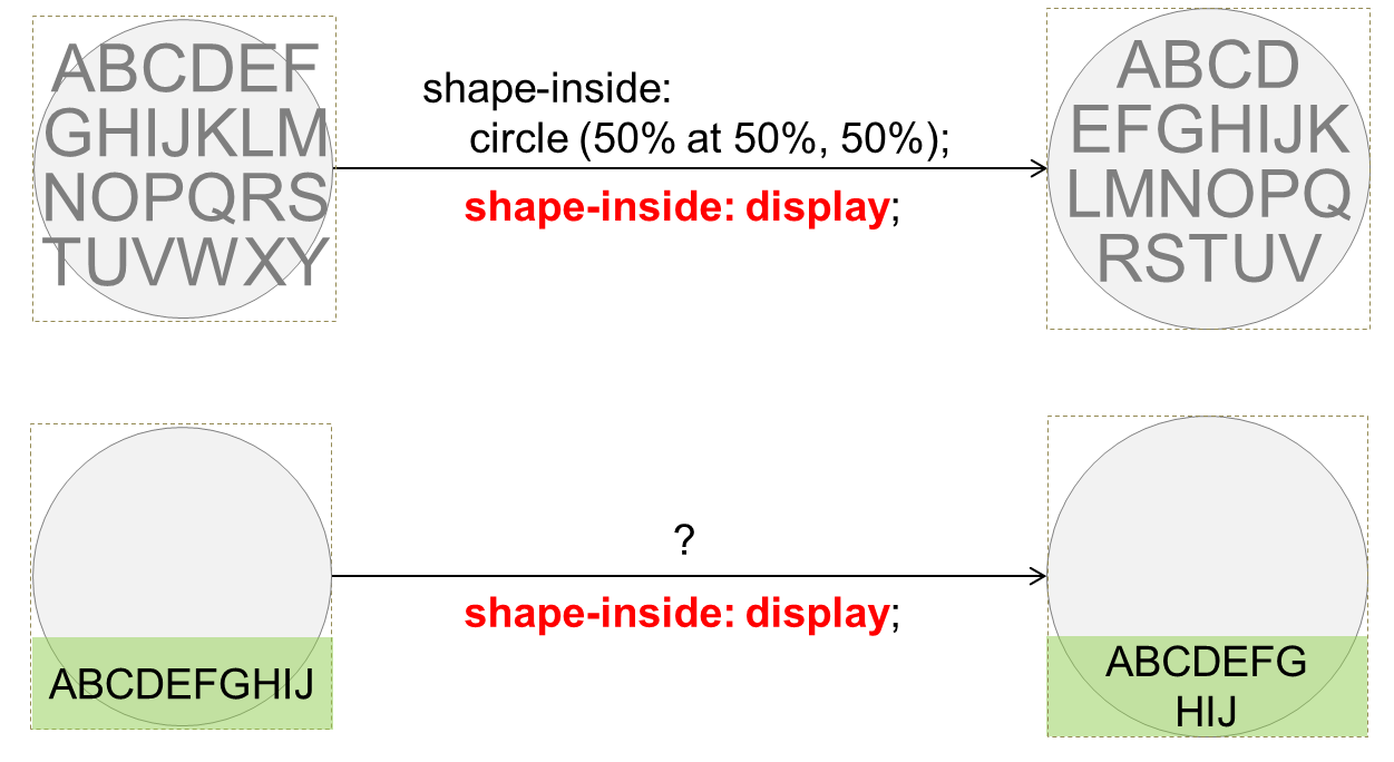
How to handle shapes with doughnut holes, etc.?
Note: This could be a current problem for CSS Shapes 1 (see: Shapes from Image):

An example of where an exclusion ('shape-outside') would break a line into parts. Box (light blue) shows the content area before subtracting the area of the left float (purple).
An example where the 'shape-inside' creates broken lines. parts.
The ''wrap-flow' property allows choosing how wrapping flows around an exclusion. It's not clear how this would apply to divided lines from the 'shape-inside'.
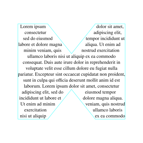
How to fill sequentially into multiple shapes
SVG 1.2 flowed text allowed text to be flowed into multiple shapes (as one shape was filled up, the text would flow into the next shape). It would be nice to preserve this functionality. (Inkscape implements this.)

An example of flowing into two separate objects. When the first object (blue) is filled completely, text begins to flow into the second object (purple).
CSS Regions may be the solution but it's not clear how it would work. A list of shapes in 'shape-inside' would be simpler.
How is the first glyph positioned in a line
When the first glyph is positioned at the edge of a wrapping area that is not a vertical line (for horizontal text), how is the first glyph positioned?
The initial-letter wrapping section of the CSS Inline specification demonstrates a related problem:
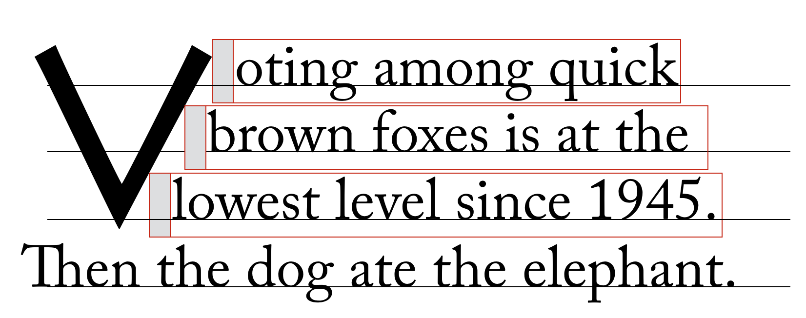
An example of flowing text next to an non-vertical edge, from the CSS Inline specification.
For positioning the first glyph in a wrapping area, presumably any spacing (equivalent to the gray boxes above) is handled by the 'shape-padding' property.
There is still a bit of uncertainty as to what part of the glyph is considered in placing it against the edge of the wrapping area: is it the box defined by the height of the em-box and the width of the glyph? Does a non-unit value of 'line-height' have any effect?