| Inkscape » Attributes » Stroke Style |    |
|---|
| Inkscape » Attributes » Stroke Style | |
|---|
In addition to Stroke paint, discussed in the previous section, Stroke attributes include stroke Width, Join style, Cap style, Dashes, and Markers. All of these attributes can be set using the Stroke style tab in the Fill and Stroke dialog. Stroke width can also be set using the Style Indicator (see below). The last part of this section is a discussion on how to make complex strokes.

Stroke width can be changed by using the Stroke style tab in the Fill and Stroke dialog, or by using the Style Indicator via a pop-up menu or by Stroke gestures.
![[Note]](../images/admons/note.png) | Note |
|---|---|
|
If you want the line width to transform with an object, you must
toggle on this option using the
|
Stroke style tab. Stroke width can be changed by using the Width entry box on the Stroke style tab of the Fill and Stroke dialog. The units are specified by the drop-down menu on the right.
Style Indicator. A Right Mouse Click on the Stroke width part of the Style Indicator opens a pop-up menu that allows the stroke width unit to be changed as well as a preset width to be selected. The stroke can also be removed with this menu.
Stroke Gestures. Stroke Gestures is the name give to changing the Stroke width by dragging the mouse from the Stroke width section of the Stroke style indicator into the Inkscape window. The principle is that as you drag the mouse, the line width will change proportionally to the distance from a 45° line from the indicator. The farther away you are, the more subtle the changes can be. The maximum width increase is a factor of 4 and the minimum width is zero. See Color Gestures for more details.
The Join style is how two lines meeting at a corner should be joined together. The options are:
 Miter join.
 Round join.
 Bevel join.
The different Join styles are shown in the figure following.

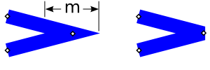
When the Miter option is selected, the length of the projection can become quite long if the two lines intersect at a small angle. In this case, it may be preferable to use the Bevel style. The Miter limit controls the point at which a Miter join automatically is converted to a Bevel join. If the distance from the inner intersection point to the tip of the triangle ("m" in the following figure) measured in stroke widths is more than the Miter limit, the join will be drawn in the Bevel style.
| Note |
|---|---|
|
The visual bounding box is determined by assuming that the Join style is Round. |
The Cap style determines how the end of a line is drawn. The options are:
 Butt cap.
 Round cap.
 Square cap.
The different Cap styles are shown in the figure below.

| Note |
|---|---|
|
The visual bounding box is determined by assuming the Cap style is Round. |
A wide selection of Dash patterns are available from the drop-down Dash menu of the Stroke style tab of the Fill and Stroke dialog. The patterns scale with the stroke width.
| Note |
|---|---|
|
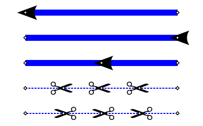
Each Dash takes on the Cap style as shown in the figure below. |

The entry box next to the Dash menu is for the Dash offset. The offset shifts the Dash pattern along the path. The units are in stroke width.
Markers are objects like arrow heads placed along a path. Different Markers can be specified for the start, middle, and end of a path. Middle Markers are placed at the location of every non-end node.
A custom Marker can be created by selecting the object or objects that you wish to use as a Marker and then using the → command. The selected objects will disappear and a new entry will appear in the Marker pull-down menus of the Fill and Stroke dialog. The Marker is created assuming a horizontal orientation for the path. The point of attachment to a node is the center of the bounding box for the Marker. Warning: While the marker will display fine in Inkscape, only a fourth of it will be displayed in most other SVG renderers. Adding the attribute style="overflow:visible" to the Marker definition will fix the problem (Bug). Note, that custom Markers can be added to Inkscape; see the section called “Custom Markers” in Chapter 24, Customization.

Note: The → procedure is a bit buggy. The new Marker may not show up in the list until another Marker is applied to the path. If multiple objects are converted, the z-order is reversed. Group the objects first to avoid this problem.
Two problems exist with Markers. The first is that Markers
do not
take the color of the stroke. This can be worked around by using the
Color Markers to Match Stroke
extension, by editing
the SVG file with the XML Editor, or
adding a custom, pre-colored Marker.
An alternative solution is to convert the path with the Markers to
a path ( →
 Object to Path
(
Shift+Ctrl+C
)). This creates a Group with the
Markers converted to separate objects, which can be colored
independently.
Object to Path
(
Shift+Ctrl+C
)). This creates a Group with the
Markers converted to separate objects, which can be colored
independently.
The second problem is that Markers scale with line width. The line width had to be reduced in the above figure for the scissors examples, to give the scissors a reasonable size. Again, one could edit the SVG file to adjust the Marker size.
![[Tip]](../images/admons/tip.png) | Tip |
|---|---|
|
To place middle Markers evenly along a path you need to have
evenly spaced nodes. For straight horizontal and vertical lines,
nodes can be distributed evenly using the Align and Distribute
dialog. To add just one node halfway between two existing nodes
click on the Insert
|
Another thing to note is that Markers are included in the Visual bounding box calculation.
A complex Stroke can be created by overlaying two or more paths
with different Stroke attributes. The easiest way to make exact
copies of a path is to use the →
 Duplicate
(
Ctrl+D
) command.
Duplicate
(
Ctrl+D
) command.
If one uses Clones of a path ( → →
 Create Clone
(
Alt+D
)),
then one can adjust the original path at a later time and all the
Clones will change too. This requires unsetting the Stroke
attributes of the original path (use the XML editor to unset the
Stroke width). Since the original path's attributes are
unset, it will not be visible and cannot be used as part of the
visible Stroke.
Create Clone
(
Alt+D
)),
then one can adjust the original path at a later time and all the
Clones will change too. This requires unsetting the Stroke
attributes of the original path (use the XML editor to unset the
Stroke width). Since the original path's attributes are
unset, it will not be visible and cannot be used as part of the
visible Stroke.

| |  | |
| Fill and Stroke Paint |  | Chapter 11. Tweak Tool |
© 2005-2017 Tavmjong Bah. |  |