| Inkscape » Positioning and Transforming » Snapping |    |
|---|
| Inkscape » Positioning and Transforming » Snapping | |
|---|
To help precisely place objects on the canvas, an object can be made to snap to a target. The target can be a points on another object, the page boundary, a Grid line, or a Guide Line. Snapping takes place when some defined point on an object, a snapping point, is near a target. Snapping can be divide into two parts: defining snapping points and setting targets. This is mostly done with the Snap Bar. Snapping was introduced in the tutorials at the beginning of the book.
Snapping can be set to always happen or only happen when a snapping point is within a set distance (the Snap Distance) from a target. Setting Snap Distance is made under the Snap tab of the Document Properties dialog.

When a snapping point is snapped to a target, a small cross will flash at the snapping site. Next to this indicator, a message indicates what snapping point and snapping target were used. In v0.48, a bounding box will also flash when it is a target of snapping. The indicator can be disabled in the Snapping section of the Inkscape Preferences dialog by unchecking the Enable snap indicator option.
A few other options can be found under the Snapping section of the Inkscape Preferences dialog:
Delay (in ms): Sets the delay between the time the cursor stops moving and snapping is attempted. Useful if there are many snapping targets (e.g., with a Grid).
Only snap the node closest to pointer: If this option is enabled, only one node is used as a snapping point on a target. This node will be highlighted as an object is dragged. Useful if an object has many snapping points. Note: if an object has too many nodes, and this option is disabled, a “convex hull”[10] is used for snapping.
Weight factor: If multiple snapping possibilities exist, the value of this parameter determines if the smallest distance between a snap point and snap target is favored (0.0) or if a snap using the closest snap point to the cursor is preferred (1.0).
This section covers defining snapping points and targets associated with objects. Defining Guide Lines and Grids as targets is covered in following sections.
The Snap Bar includes a variety of clickable icons that toggle
various snap points and targets on and off. It is divided into a
number of sections.
The first section has one icon (
 )
for globally toggling on or off snapping (this includes snapping to
Guide Lines and Grids). The second section concerns snapping to
and from points defined by objects' bounding boxes. The third
section covers options for snapping to and from nodes and
handles. The last section has icons for toggling on and off
snapping to the page boundary, Guide Lines, and
Grids. Note that snapping of bounding boxes is independent of
snapping of nodes (i.e., a node cannot be directly snapped to a
point on a bounding box and vice versa). Both bounding boxes and nodes,
however, can be snapped to the page boundary, Guide Lines and
Grids.
)
for globally toggling on or off snapping (this includes snapping to
Guide Lines and Grids). The second section concerns snapping to
and from points defined by objects' bounding boxes. The third
section covers options for snapping to and from nodes and
handles. The last section has icons for toggling on and off
snapping to the page boundary, Guide Lines, and
Grids. Note that snapping of bounding boxes is independent of
snapping of nodes (i.e., a node cannot be directly snapped to a
point on a bounding box and vice versa). Both bounding boxes and nodes,
however, can be snapped to the page boundary, Guide Lines and
Grids.
The section for snapping bounding box items includes the icons for enabling and disabling:
 : Snap bounding box corners. Global
control for bounding box snapping. If enabled,
bounding box corners are always snap points.
: Snap bounding box corners. Global
control for bounding box snapping. If enabled,
bounding box corners are always snap points.
 : Snap to edges of a bounding box.
Note that edges are never snap points.
: Snap to edges of a bounding box.
Note that edges are never snap points.
 : Snap to bounding box corners.
 : Snap from and to midpoints
of bounding box edges.
: Snap from and to midpoints
of bounding box edges.
 : Snapping from and to centers
of bounding boxes.
: Snapping from and to centers
of bounding boxes.
Most types of nodes and handles can be snap points and/or targets. These include path nodes, regular Shape nodes and handles, Rectangle round-corner handles, and Rotation center handles. The options in the Snap Bar section for nodes and handles includes icons for enabling and disabling:
 : Snap nodes or handles. If enabled,
selected nodes are always snap points.
: Snap nodes or handles. If enabled,
selected nodes are always snap points.
 : Snap to paths.
 : Snap to path
intersections. Snap to paths must be enabled for this option
to be enabled.
: Snap to path
intersections. Snap to paths must be enabled for this option
to be enabled.
 : Snap to cusp nodes.
nodes.
: Snap to cusp nodes.
nodes.
 : Snap to smooth nodes.
 : Snap from and to
midpoints of line segments. This includes straight line segments
on either Shapes or paths).
: Snap from and to
midpoints of line segments. This includes straight line segments
on either Shapes or paths).
 : Snap from or to centers of objects.
(The same point as the center of the bounding box.)
: Snap from or to centers of objects.
(The same point as the center of the bounding box.)
 : Snap from an to an item's
Rotation center.
: Snap from an to an item's
Rotation center.
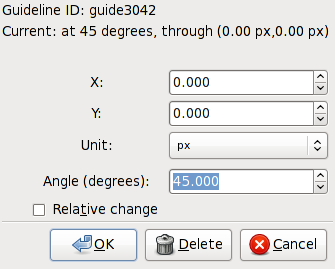
Guide Lines are individual lines that can be arbitrarily placed. They are defined by an x-y anchor (origin point) through which the line passes and an angle. The anchor is shown as a small circle on the line.
Guide Lines can be hidden or unhidden by using
→
 Guides
(
|
). To be active, a
Guide Line must be visible. Snapping to Guide Lines
can be enabled or disabled by clicking on the
Guides
(
|
). To be active, a
Guide Line must be visible. Snapping to Guide Lines
can be enabled or disabled by clicking on the
 icon in the Snap Bar.
The color of Guide Lines can be changed under the Guides tab in the Document Properties dialog. Snapping of Guide Lines to other objects can be enabled or disabled also under this tab.
To create a Guide Line, Left Mouse Drag from the left Ruler onto the canvas for a vertical Guide Line or from the top Ruler for a horizontal Guide Line. An angled Guide Line can be created by dragging from the end of a Ruler. By default, the angle is set to 45° if a rectangular Grid is displayed or parallel to the angled lines if an axonometric Grid is displayed.
Guide Lines can also be automatically created at the edges of the Page by using the → command. They can also be created around objects as discussed in a following section.
Guide Lines can be translated and rotated using the mouse:
Left Mouse Drag: Translate Guide Line. Both the Guide Line and anchor are moved. If dragged off the page, the Guide Line is deleted.
Shift+Left Mouse Drag: Rotate Guide Line. Rotation is around the anchor. You must be a small distance away from the anchor for rotation to be enabled.
Ctrl+Left Mouse Drag: Move the anchor, constrained to the Guide Line.
Ctrl+Shift+Left Mouse Drag: Rotate Guide Line with constraint. Angle snaps to multiples of the Rotation snap angle, (15 degrees, by default).
Del: While over a Guide Line, delete the Guide Line.
Guide Lines can be precisely placed by using the Guide Line dialog, called up by double-clicking on a Guide Line. A check box toggles between absolute and relative placement.
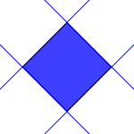
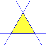
Guide Lines can be created from objects using the → ( Shift+G ) command. The keyboard shortcut works with the Select Tool, shape tools, Bezier Tool, and Pencil Tool. Different objects are converted in different ways. In each case, the selected objects are deleted unless the Keep objects after conversion to guides entry is checked in the Tools section of the Inkscape Preferences dialog.
If a Group is selected, Guide Lines are drawn for each object in the Group, unless the Treat groups as a single object entry is checked in the Tools section of the Inkscape Preferences dialog.
Guide Lines from a rotated Rectangle.
|
Guide Lines from a triangular path, one line for each straight path.
|
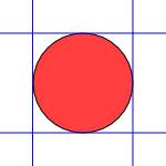
Guide Lines from a circle, lines determined from the bounding box.
|
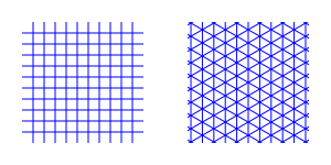
A Grid is composed of two or three sets of evenly spaced parallel lines. A Rectangular Grid consists of horizontal and vertical lines, much like a sheet of ordinary graph paper. An Axonometric Grid consists of three sets of parallel lines, typically one vertical and two at 30° angles from the horizontal. It is often used to draw three-dimensional objects.
Grids can be created and edited on the Grids tab of the Document Properties dialog. To create a Grid, select the type (Rectangular or Axonometric) from the drop-down menu at the top of the dialog and then click on the New button. The parameters for the new Grid will then be editable under a tab in the bottom of the dialog. It is possible to have more than one Grid defined (and in use). Each Grid will have a tab entry.

Each Grid can individually be Enabled
and made Visible by the check boxes on the
Defined Grid tabs. If a Grid is not
enabled, it will not be visible. However a Grid can be
enabled and not visible. All Grids can be enabled or disabled
by clicking on the
 in the Snap Bar or by
using the global command →
in the Snap Bar or by
using the global command →
 Grid
(
#
). This setting overrides
the settings on the individual Grid tabs. Note: There is no
visual indication whether this overall setting is on or off if the
visibility of the individual Grids are all set off. Note also
that, depending on the zoom scale, not all Grid lines are
shown. “Missing” lines will not be snapped to if
the Snap to visible grid lines only box is
checked under the Grids tab.
Grid
(
#
). This setting overrides
the settings on the individual Grid tabs. Note: There is no
visual indication whether this overall setting is on or off if the
visibility of the individual Grids are all set off. Note also
that, depending on the zoom scale, not all Grid lines are
shown. “Missing” lines will not be snapped to if
the Snap to visible grid lines only box is
checked under the Grids tab.
For both types of Grids, the Grid unit can be selected from a drop-down menu and the Grid origin can also be specified. For Rectangular Grids, the x and y spacing can be set independently. For Axonometric Grids the x and z spacings are derived from the y spacing and the angle settings. In both cases the color of the lines can be set by clicking on the color box and making changes in the dialog that pops up.
The default Grid parameters can be modified in the Grids section of the Inkscape Preferences dialog.
Different “views” of the same drawing share the same Grids but the Grids can be enabled or made visible independently for each view.
[10] The convex hull is the boundary around a set of nodes that would be equivalent to a rubber band stretched around them.. See: Wikipedia entry.
| |  | |
| Transformations |  | Alignment and Distribution of Objects |
© 2005-2017 Tavmjong Bah. |  |