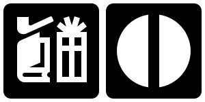
I poked around the Internet for a set of symbols to add to Inkscape for use in the new Symbols Dialog. I was looking for a set that was more artistic than the typical symbol sets used for diagramming (I already added logic symbols as an example). I found that there are surprisingly few sets of high quality symbols available for free. Search results are dominated by commercial companies (who are happy to sell you symbols that are in the public domain). I rather quickly settled on the
AIGA (American Institute of Graphic Arts)
symbol set. This set was commissioned by the US Department of Transportation (DOT) in the 1970’s to create a standard set of symbols for use in airports and other transportation hubs. You will have to have lived your entire life as a hermit to have never seen the symbols in use. This symbol set served as the basis of other symbols sets like the
NPS symbol set for maps, the Japanese
ECOMO Public Information symbol set, and the
ISO 7001 standard symbol set.
The AIGA symbols have held up well over time (the symbols are almost 40 years old!). Only one symbol is really outdated (the Gift Shop symbol with a pipe) and one symbol never caught on (exit).
I chose to redraw the symbols using the EPS files from the AIGA website as templates. This allowed me to optimize the SVG, aligning nodes where practical on pixel boundaries as well as using SVG elements like <circle> where possible. Redrawing the 50+ symbols gives one an insight into their design. The symbols were designed to be easily recognizable from a distance thus they use simple lines, circles, and circular arcs. Bodies are represented without feet or hands. The symbols were drawn in a pre-CAD era. This may explain some anomalies like figures not being accurately centered and small inconsistencies (i.e. the key in the Baggage Lockers symbol scaled differently than the one in the Car Rental symbol). Cut and paste meant a different thing in the 1970s.
The NPS symbol style is based on the AIGA style with some minor changes. The changes were probably motivated by the different target use of the two sets; the AIGA symbols targeted signs while the NPS symbols are for maps. In retrospect, the NPS set might have been a better choice to have added to Inkscape. The NPS set also has the advantage of being regularly updated.
Both the ECOMO and ISO 7001 symbols sets are obviously inspired by the AIGA set. These sets, however, have the appearance of being designed by committee. There are style inconsistencies between various symbols, and those symbols that have obvious roots in AIGA seem to have often been changed for just the sake of change. Comparisons between the sets are complicated since the ISO standard is not freely available on the Web.
One symbol that is conspicuously missing from the AIGA set is a symbol for Handicap Access; handicap access just wasn’t as an important issue among transportation planners back in the 1970s. The
International Symbol of Access (ISA) was created in 1968. The original symbol left a lot to be desired from an artistic/design point of view. It basically looks like a stick figure with a head thrown on… and this is exactly how it was created. The original designer, a student, created a headless stick figure sitting in an oversized wheelchair. The head was added by the director the Swedish Handicap Institute to
humanize the figure. The organization Rehabilitation International (RI) worked to get the symbol accepted by the ISO. This symbol is currently part of the ISO 7000 standard. A version more consistent with the style of the AIGA symbols is in the ISO 7001 standard as well as the 1996 NPS symbols set. A version with feet (not as consistent with the AIGA style) is in the current NPS symbol set. All these versions of the Handicap Access symbol have been subject to critique as it shows a disabled person sitting passively (helplessly?) in a wheelchair. A newer version, showing an active wheelchair user has been
created but not widely adopted (in fact,
RI appears to be hostile to it). And even this new symbol is subject to criticism because it represents only one kind of handicap access.


Fantastic summary Tav, Really appreciate the research and the write up.
I’m hoping thenounproject.org will help us better discriminate between public domain and commercial licenses in their results.
search for swing [1] returns one public domain image
whereas searching for play [2] returns results of varying licenses.
It would be ideal to eliminate the results for licenses you dont want to use rather than having to click on each and ‘discover’ an undesirable license.
I’m glad we’re keeping it simple for now.
[1] http://thenounproject.com/noun/swing/#icon-No206
[2] http://thenounproject.com/noun/play/
just realized that I meant thenounproject.com
it seems the .org is something else