Want evenly spaced lines of text like when writing on the lined paper we all used as kids? Should be easy. Turns out with CSS it is not. This post will show why. It is the result of too much time reading specs and making tests as I worked on Inkscape’s multi-line text.
The first thing to understand is that CSS text works by filling line boxes with glyphs and then stacking the boxes, much as is done in printing with movable type.
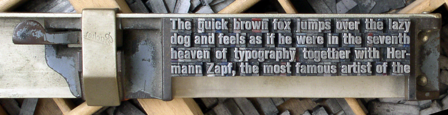
Movable type placed in a composing stick. The image has been flipped horizontally so the glyphs are legible. (Modified from photo by Willi Heidelbach [CC BY 2.5], via Wikimedia Commons)
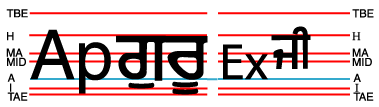
A line of CSS text is composed of a series of glyphs. It corresponds to a row of movable type where each glyph represents (mostly) a piece of type. The CSS ‘font-size’ property corresponds to the height of the type. A CSS line box contains a line of CSS text plus any leading (extra space) above and below the line.
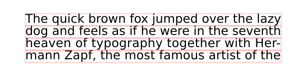
The same four lines of text as in the previous figure. The CSS line boxes are shown by red rectangles. The line boxes are stacked without any leading between the lines.
The lines in the above figure are set tight, without any spacing between the lines. This makes the text hard to read. It is normal in typesetting to add a bit of leading between lines to give the lines a small amount of separation. This can be done with CSS through the ‘line-height’ property. A typical value of the ‘line-height’ property would be ‘1.2’ which means in the simplest terms to make the distance between the baselines of the text be 1.2 times the font size. CSS dictates that the extra space be split, half above the line, half below the line. The following example uses a ‘line-height’ value of 1.5 (to make the figure clearer).
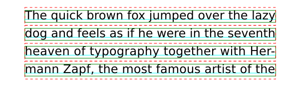
The same four lines of text as in the previous figure but with leading added by a ‘line-height’ value of 1.5. The distance between the baselines (light-blue lines) is 1.5 times the font size. (Line boxes without leading are shown in green, line boxes with leading in red.)
Unlike with physical type faces, lines can be moved closer together than the height of the glyph boxes by using a ‘line-height’ value less than one. Normally you would not want to do this.

The same four lines of text as in the previous figure but with negative leading generated by a ‘line-height’ value of 0.8.
When only one font is used (same family and size), the distance between the baselines is consistent and easy to predict. But with multiple fonts it becomes a bit of a challenge. To understand the inner workings of ‘line-height’ we first need to get back to basics.
Glyphs are designed inside an em box. The ‘font-size’ property scales the em box so when rendered the height of the em box matches the font size. For most scripts, the em box is divided into two parts by a baseline. The ascent measures the distance between the baseline and the top of the box while the descent measures the distance between the baseline and the bottom of the box.

The coordinate system for defining glyphs is based on the “em box” (blue square). The origin of the coordinate system for Latin based glyphs is at the baseline on the left side of the box. The baseline divides the em box into two parts.
The distinction between ‘ascent’ and descent’ is important as the height of the CSS line box is calculated by finding independently the maximum ascent and the maximum descent of all the glyphs in a line of text and then adding the two values. The ratio between ascent and descent is a font design issue and will be different for different font families. Mixing font families may then lead to a line box height greater than that for a single font family.
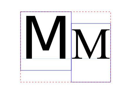
Two ‘M’ glyphs with the same font size but from different font families (DejaVu Sans and Scheherazade). Their glyph boxes (blue rectangles) have the same height (equal to the em box or font size) but the boxes are shifted vertically so that their baselines are aligned. The resulting line box (dashed red rectangle), assuming a ‘line-height’ value of ‘1’, has a height that is greater than if just one font was used.
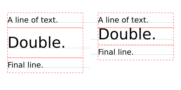
Keeping the same font family but mixing different sizes can also give results that are a bit unexpected.
Left: Text with a font size of 25 pixels and with a ‘line-height’ value of ‘2’. Right: Same as left but font size of 50px for middle line. Notice how the line boxes (red dashed rectangles) are lined up on a grid but that the baselines (light-blue lines) on the right are not; the middle right line’s baseline is off the grid.
So far, we’ve discussed only ‘line-height’ values that are unitless. Both absolute (‘px’, ‘pt’, etc. ) and relative (‘em’, ‘ex’, ‘%’) units are also allowed. The “computed” value of a unitless value is the unitless value while the “computed” value of a value with units is the “absolute” value. The actual value “used” for determining line box height is for a unitless value, the computed value multiplied by the font size, while for the values with units it is the “absolute value” For example, assuming a font size of 24px:
- ‘line-height:1.5′
- computed value: 1.5, used value: 36px;
- ‘line-height: 36px’
- computed and used values: 36px;
- ‘line-height: 150%’
- computed and used values: 36px;
- ‘line-height: 1.5em’
- computed and used values: 36px.
The importance of this is that it is the computed value of ‘line-height’ that is inherited by child elements. This gives different results for values with units compared to those without as seen in the following figure:
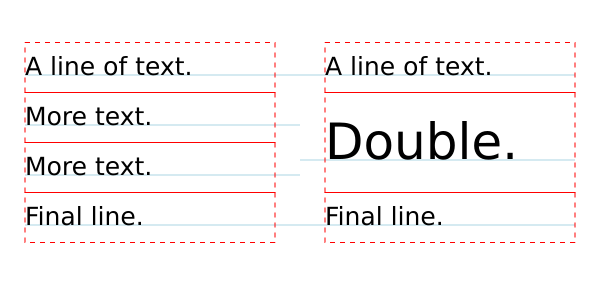
Left: Text with a font size of 25 pixels and with a ‘line-height’ value of ‘2’. Right: Same as left but ‘line-height’ value of ‘2em’. With the unitless ‘line-height’ value, the child element (second line, span with larger font) inherits the value ‘2’. As the larger font has a size of 50px, the “used” value for ‘line-height’ is 100px (2 times 50px) thus the line box is 100px tall. With the ‘line-height’ value of ‘2em’, the computed value is 50px. This is inherited by the child element which is then used in calculating the line box height. CodePen.
The astute observer will notice that in the above example the line box height of the middle line on the right is not 50 pixels as one might naturally expect. It is actually a bit larger. Why? Recall that the line box height is calculated from the maximum ascent and maximum descent of all the glyphs. One small detail was left out. CSS dictates that an imaginary zero width glyph called the “strut” be included in the calculation. This strut represents a glyph in the containing block’s initial font and with the block’s initial font size and line height. This throws everything out of alignment as shown in the figure below.

Let the ‘A’ represents the strut
. The glyph boxes for the ‘A’ and ‘D’ without considering line height are shown by blue rectangles. The glyph boxes with line height taken into account are shown by red-dashed rectangles. For the ‘D’, the glyph boxes with and without taking into account the line height are the same. Note that both the ‘A’ and ‘D’ boxes with line height factored in have the same height (2em relative to the containing block font size). The two boxes are aligned using the ‘alphabetic’ baseline. This results in the ‘A’ glyph box (with effect of line height) extending down past the bottom of the ‘D’ glyph box. The resulting line box (solid-pink rectangle) height is thus greater than either of the glyph box heights. The extra height is shown by the light gray rectangle.
So how can one keep line boxes on a regular grid? The solution is to rely on the strut! The way to do this is to make sure that the ascents and descents all child elements are smaller than the containing block strut’s ascent and descent values. One can do this most easily by setting ‘line-height’ to zero in child elements.
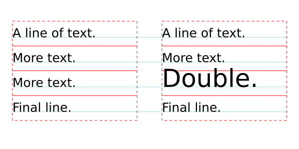
Text with evenly spaced lines. Left: All text with the same font size. Right: The third line has text with double the font size but with a ‘line-height’ value of ‘0’. This ensures that the strut controls the spacing between lines. CodePen.
As one can see, positioning text on a regular grid can be done through a bit of effort. Does it have to be so difficult? There maybe an easier solution on the horizon. The CSS working group is working on a “Line Grid” specification that may make this trivial.


