SVG Path Morphing

As usual, if you are reading this in a blog aggregator and the images don’t display correctly, try viewing on my blog website. Aggregators don’t play well with SVG.
Four different Batman logos.
I have a project where I want to morph some paths. To experiment a bit, I looked for something simple to start with. I came across a poster of Batman logos over time. What a perfect thing to morph, I thought. I then looked a little bit further and saw that the designer actually got their idea from someone who had already produced a video of morphing Batman logos. Well, I still though it would be interesting to do in SVG so I continued. I wanted to use SMIL animation as this is simpler than JavaScript and will work where JavaScript is disabled due to security concerns. SMIL works in all the major browsers except IE. Here is the result:
Morphing Batman logos.

A variety of Batman logos, animated with SMIL.

I used Inkscape to trace the paths and then extracted the path data using the XML Editor. I pasted the data into a hand-written SVG file. Inkscape’s SVG is rather verbose and adding animation inside Inkscape is not so simple. Here is a very simple animation of a short path. Note how the <animate> element is inserted in between opening and closing <path> element tags. The d attribute is animated with the values attribute containing the required path data.
  <path d="M 100,50 100,250 300,250">
    <animate dur="5s" repeatCount="indefinite"
             attributeName="d"
	     values="M 100,50 300, 50 300,250;
		     M 100,50 100,250 300,250;
		     M 100,50 300, 50 300,250;"/>
  </path>
Here are a few notes about the process:
  • The paths must have the exact same structure. I took a look at the various logos and decided on a set that shared the same topological features so they would use the same number of Bezier curves. I choose to use all Cubic Bezier curves since they can simulate straight lines too.
  • In the Inkscape Preferences dialog under the SVG output tab, I disabled the use of relative paths. Inkscape can choose to use relative path data if it results in a shorter path string. This can result in inconsistent path structure. At the same time I reduced the numeric precision to three decimal places, I wasn’t so interested in getting the logos perfectly exact.
  • For each new logo, I copied the path from the previous logo to insure the same structure. I then deleted the right half of the path, adjusting only the left half to match the new logo. To get the right half, I duplicated the path and flipped the copy horizontally and moved it into place. I then combined the two halves into one path, merging the end nodes. I tried to use the same procedure each time to keep the path syntax the same. Occasionally, I ended up with a path that required flipping horizontally to get the starting point at the right place.
  • The animation part is rather straight forward. A few things to know: One has to repeat the first path at the end. I repeated each path twice so there would be a bit of a pause between morphs. I put each path on its own line so I could spot errors quicker. The most common error I made was forgetting the semicolon at the end of each path. Chrome has a bug where space after the last quote mark kills the animation. I am sure a person with more SMIL fu could come up with a better way of handling the morphing and the text fades but this SVG file does what I set out to do.

Transportation and Passenger Symbols

I poked around the Internet for a set of symbols to add to Inkscape for use in the new Symbols Dialog. I was looking for a set that was more artistic than the typical symbol sets used for diagramming (I already added logic symbols as an example). I found that there are surprisingly few sets of high quality symbols available for free. Search results are dominated by commercial companies (who are happy to sell you symbols that are in the public domain). I rather quickly settled on the AIGA (American Institute of Graphic Arts) symbol set. This set was commissioned by the US Department of Transportation (DOT) in the 1970’s to create a standard set of symbols for use in airports and other transportation hubs. You will have to have lived your entire life as a hermit to have never seen the symbols in use. This symbol set served as the basis of other symbols sets like the NPS symbol set for maps, the Japanese ECOMO Public Information symbol set, and the ISO 7001 standard symbol set.
Examples of AIGA symbols.

Some common AIGA symbols (Toilets, Smoking, Immigration, Telephone).

The AIGA symbols have held up well over time (the symbols are almost 40 years old!). Only one symbol is really outdated (the Gift Shop symbol with a pipe) and one symbol never caught on (exit).
Examples of AIGA symbols.

Example of an outdated symbol (Shops) and an unused symbol (Exit).

I chose to redraw the symbols using the EPS files from the AIGA website as templates. This allowed me to optimize the SVG, aligning nodes where practical on pixel boundaries as well as using SVG elements like <circle> where possible. Redrawing the 50+ symbols gives one an insight into their design. The symbols were designed to be easily recognizable from a distance thus they use simple lines, circles, and circular arcs. Bodies are represented without feet or hands. The symbols were drawn in a pre-CAD era. This may explain some anomalies like figures not being accurately centered and small inconsistencies (i.e. the key in the Baggage Lockers symbol scaled differently than the one in the Car Rental symbol). Cut and paste meant a different thing in the 1970s. The NPS symbol style is based on the AIGA style with some minor changes. The changes were probably motivated by the different target use of the two sets; the AIGA symbols targeted signs while the NPS symbols are for maps. In retrospect, the NPS set might have been a better choice to have added to Inkscape. The NPS set also has the advantage of being regularly updated.
Examples of AIGA vs NPS symbols.

Comparison of AIGA (left) vs NPS (right) symbols. Note how in the NPS version the fork has been simplified and how the separation between the legs/arms and bodies has been increased.

Both the ECOMO and ISO 7001 symbols sets are obviously inspired by the AIGA set. These sets, however, have the appearance of being designed by committee. There are style inconsistencies between various symbols, and those symbols that have obvious roots in AIGA seem to have often been changed for just the sake of change. Comparisons between the sets are complicated since the ISO standard is not freely available on the Web.
Examples of AIGA vs ECOMO and ISO symbols.

Comparison of AIGA (left), ISO 7001 (middle), and ECOMO (right) symbols.

One symbol that is conspicuously missing from the AIGA set is a symbol for Handicap Access; handicap access just wasn’t as an important issue among transportation planners back in the 1970s. The International Symbol of Access (ISA) was created in 1968. The original symbol left a lot to be desired from an artistic/design point of view. It basically looks like a stick figure with a head thrown on… and this is exactly how it was created. The original designer, a student, created a headless stick figure sitting in an oversized wheelchair. The head was added by the director the Swedish Handicap Institute to humanize the figure. The organization Rehabilitation International (RI) worked to get the symbol accepted by the ISO. This symbol is currently part of the ISO 7000 standard. A version more consistent with the style of the AIGA symbols is in the ISO 7001 standard as well as the 1996 NPS symbols set. A version with feet (not as consistent with the AIGA style) is in the current NPS symbol set. All these versions of the Handicap Access symbol have been subject to critique as it shows a disabled person sitting passively (helplessly?) in a wheelchair. A newer version, showing an active wheelchair user has been created but not widely adopted (in fact, RI appears to be hostile to it). And even this new symbol is subject to criticism because it represents only one kind of handicap access.
Examples of handicap access symbols.

Comparison of various Handicap Access symbols. From left to right: original (ISO 7000), NPS (1996) and ISO 7001, NPS (current), active version (quasi AIGA style).

SVG Working Group Meeting Report – Rigi Kaltbad

The SVG Working Group had a three day Face-to-Face meeting in Rigi Kaltbad (Switzerland) just after The Graphical Web (formerly SVG Open) conference. Thanks to the conference organizer, Andreas Neumann, I was able to attend the meeting in person. While a lot of the work focused on the nitty-gritty details of more interest to browser vendors and developers, there were still a number of things of interest to artists and designers:
  • New path commands will be added to make the drawing of arcs easier: “arc”, “ellipse”, and two forms of “arcTo”. These will match the path implementation found in canvas.
    Two lines connected by a curve of radius r.

    An example of arcTo. In this example, p0 is the previous path point. p1, p2, and the radius r are arguments of the arcTo command.

  • If arcTo isn’t enough goodness for you, making rounded corners for shapes, polygons, and polylines will be child’s play with a new rounded corner option where one supplies the radius for the rounded corners. It is still to be decided if generic paths will have this option.
    Two paths with rounded corners of radius r.

    An example of rounded corners for two polyline elements.

  • Speaking of polygons, SVG2 will have a star/polygon element for convenience. It will support most if not all the options available with the Inkscape Star Tool.
  • A new extrapolated line join style was tentatively approved at the last SVG Face-To-Face meeting (see my previous blog entry). It is now approved to be added to the specification.
  • Hatches have been approved. The exact syntax has yet to be worked out. It will be something like:
    <hatch id="complex" angle="90"
            hatchUnits="userSpaceOnUse"
            pitch="10" x="0" y="0">
        <hatchPath offset="0" stroke-width="1"/>
        <hatchPath offset="5" stroke-width="1"
                   stroke-dasharray="5 2 1 2"/>
    </hatch>
    
    <hatch id="complex" angle="90"
            hatchUnits="userSpaceOnUse"
            pitch="6" x="0" y="0">
        <hatchPath offset="0" stroke-width="1"
           d="m 1,0 c 0,4 8,6 8,10 8,14 0,16 0,20"/>
    </hatch>
    
    Two examples of hatchings.

    Examples of the hatches given above.

    Cross hatching will be handled by allowing one to combine two hatchings together.
  • Marker fill automatically matching stroke color got a step closer to reality with “context-fill”, “context-stroke”, and “context-fill-opacity” being approved for SVG2. A new property, “context-value” was also endorsed. This value allows one to pass in stroke style properties such as “dash-array”.
    <marker id="yeah" fill="context-stroke" .../>
    
  • The Working Group endorsed auto-smoothing of mesh gradients (without smoothing, gradients are subject to Mach banding). Auto-smoothing is done both by Adobe and CorelDRAW. However, when they export the meshes, for example to PDF, they export an 8 x 8 array of patches for each native patch since PDF (and PostScript) don’t have smoothing built in. The Working Group has asked the Adobe representative if Adobe would be willing to make public their smoothing algorithm. This would allow, for example, Illustrator to directly write smoothed meshes to SVG.
  • Connectors, useful for flow charts, organizational charts, etc. will be standardized in a separate module. A very simple routing (basically a straight line) will be provided. Content creation programs (e.g. Visio, Dia, Inkscape) can override the default routing and supply a more complicated connecting path. See the Editor’s Draft for details.
  • As a result of a comment at SVG Open, the Working Group has approved Internationalization of <title> and <desc> elements. One will be able to supply multiple elements with different “lang” attributes. An SVG renderer will select which element to use via these attributes.
  • The Working Group is investigating a new type of noise for filters that would be easier for hardware acceleration.
  • Mozilla demonstrated the use of SVG inside of Open Type Fonts. Firefox nightly has experimental support for Mozilla’s SVG OTF proposal. Adobe also has a proposal on the table with a different syntax. The two proposals will need to be merged.
    The letter A and a star rendered from a test Open Type Font using SVG glyphs.

    Here are two glyphs with different fill colors that are passed into the glyphs using “context-fill” and “context-stroke”.

Meeting minutes can be found at:

SVG Working Group Meeting Report

The SVG Working Group had a three day Face-to-Face meeting in Hamburg this week. The last day was devoted to working with the CSS Working Group on joint items. I attended most of it via telephone. A lot of the discussions had to do with stategies for getting SVG2 out or with technical stuff. But there were a number of things that might be of interest to Inkscape users and others.
  • Paint Order: It was resolved that the SVG will allow the order in which fill, stroke, and markers for a single graphics element are painted to be specified. At the moment the stroke is always painted on top of the fill, and markers on top of everything. Being able to paint the fill on top of the stroke is quite important for text.
    The letter 'B' with normal fill order, fill on top, and markers underneath.

    A letter with various paint orders.

  • Marker Clipping: At the moment, in order to avoid the path from showing under the tip of an arrowhead, the arrowhead must extend past the end of the path. In Inkscape, this prevents things like snapping the arrow tip to a line since the path end is not at the same place as the arrow tip. One of the SVG group members is going to work out a way to specify a clipping region for a marker that would apply to the path below thus eliminating this problem.
    Marker clipping applied to an arrow and to a circle.

    Demonstration of the use of marker clipping. The red dotted line indicates the clipped area. Clipping only applies to the path the marker is attached to.

  • Marker positioning: The current spec only allows markers placed at the ends of a path or at nodes. The WG agreed that more complex marker placement would be supported, For example one will be able to alternate between two markers and place them every 20px along a path.
    A path with two alternating markers placed at equal intervals.

    A path with markers. The markers are placed by distance along path.

  • Masking: Masks will gain an attribute to specify whether to use alpha or luminance in the masking calculation.
  • Screening Filter Primitive: The group was supportive of my proposal to add a screening filter primitive. It would not be added to the SVG2 specification directly but to the CSS/SVG joint filters specification that has been split out from the SVG spec.
  • Gradients Along/Across Paths (and Variable Stroke Opacity): While group members were interested in this, it turns out to be quite difficult to implement so the group pushed this off to the future. (The Adobe rep said that it was a real pain to export it to other formats.) If Inkscape were to support this somehow (mesh fallback?), it would help push it into the spec.
  • New Stroke Join: Coming from Johan Engelen’s Power Stroke work inside Inkscape, I propsed that the SVG2 specification add a new stroke-join option. Currently you have the choice of beveled, rounded, or mitered. When a path contains two curved segments joined at a sharp point, the mitered option doesn’t look so good. Johan’s Power Stroke allows an “extrapolated” join where the curvature of the paths is taken into account. The SVG WG liked this idea and approved it subject to defining the math needed precisely. One factor in its adoption will be than none of the graphics libraries used by the browsers includes such a join.
    A demonstration of the different existing SVG join styles and the proposed new style.

    The existing join styles with the proposed extrapolated join style.

A Spinning Newspaper or a Study of HTML vs. SVG

While wandering through the Web, I came across a simple but nice demo of CSS3 Animations: a spinning newspaper cover like one would see in an old black and white movie. It would be just perfect for a personal website I have but there is one problem: the example uses an image, JPEG to be exact. I want to be able to easily change the text. No problemo… I can just substitute a <div> for the <img> element and then fill that how I want. To begin, I followed the demo example and used the following CSS: .newspaper { animation-name: spinning; animation-duration: 1s; animation-timing-function: ease; animation-iteration-count: 1; animation-direction: normal; } @keyframes spinning { 0% {width:10px; height: 7px; transform:rotate(0deg);} 100% {width:468px; height: 330px; transform:rotate(1440deg);} } One thing to note is that this CSS won’t actually work in any browser at the moment. Firefox and Webkit based browsers support CSS3 Animations but only using prefixes (i.e. -moz-, -webkit-). While prototyping and testing in multiple browsers I found it convenient to use the “-prefix-free” JavaScript code that automatically adds the necessary prefixes (read the documentation about how to use it locally with Chrome and Opera). After you get everything working, you can manually add the prefixes if you need to avoid using JavaScript. I added a <div> for the newspaper name and immediately came across the first problem. The text doesn’t scale. Following the given example, I adjusted the @keyframe to include “font-size: 0%” and “font-size: 100%”. This didn’t work as expected. The fonts scaled alright, but as they scaled the font size was being rounded to an integer. This lead to discrete jumps in font size which caused visable effects in the text layout. I have to admit my CSS box-model fu is sadly lacking. I was having trouble getting everything to layout correctly. Later I realized that I had introduced a typo in my CSS style sheet. <rant>I personally hate how HTML5 has gone the route of allowing errors to go unnoticed. Coming from a programming background, I much prefer that my HTML/CSS crashes and burns when there is a syntax error. I’ve wasted more time trying to understand why something isn’t working the way I think it should only to discover later I was missing a simple colon.</rant> Given the frustrations I was having with CSS layout and with the font-sizing problem (which was a show stopper), I decided to try inline SVG for the layout. This worked out suprising well and within a few minutes I had the layout I wanted. (It helped that I was able to recycle some of the CSS classes I had already defined.) I still had a problem with how the animation was working. The transformation origin was moving so the spinning was starting around the top-left corner. At this point I realized that the @keyframes CSS was not optimal. There was no need to change the width, height, and font-size when a scaling could be simply added to the transform. I change the appropriate lines to: 0% { transform:scale(0) rotate(0deg);} 100% { transform:scale(1) rotate(1440deg); } Now the amination worked as expected. Once I got the SVG version working, I went back and tackled the CSS/HTML version. It took quite awhile, but I finally got it to look (almost) like the SVG version. Having completed that exercise I can give the following summary: SVG Advantages:
  • Easy layout. No dealing with collapsing margins, shifting borders, paddings, floats, vertical centering hacks. The one problem I came across was that paths must be defined in terms of user units (pixels) and not the percentages that I used everywhere else.
  • Easy to add vertical separators of random length.
CSS Advantages:
  • SVG does not have text wrapping but one can use a <p> inside <foreignobject>.
  • SVG text cannot automatically be vertically centered. Changing font-size requires manually shifting text.
Here are the final figures. Note that these are just PNGs. For a look at the spinning SVG and HTML covers go to my website (it is too difficult to get these to work inside the blog).

SVG/CSS

Newspaper cover mockup.

HTML/CSS

Newspaper cover mockup.

Animation in SVG and CSS

David White created a nice SVG background he calls “The digital river” with animated circles. Unfortunately it only works in Firefox due to incorrect handling of events inside the <use> tag (which allows cloning of objects, in this case a circle) by other browsers. The other browsers apply mouse events to the referenced object rather than just the cloned objects. David’s SVG uses SMIL for animation. Unfortunately, Microsoft has declared in no uncertain terms that it will not implement SMIL in their browers. They see CSS Transitions and CSS Animations as the proper way forward for supporting animation in SVG however no browser at the moment supports this although all the browsers do support experimental (read: prefixed) CSS transitions and animations on HTML elements. Here are two experiments inspired by David’s work. The first uses CSS with CSS Transitions, the second SVG with SMIL. Pass your cursor over the circles. The CSS version uses rounded corners on <div>s to simulate circles. It has the advantage of cross-browser support (except Firefox messes up the first row of circles). The SVG version only works properly in Firefox. It is more powerful as you can easily scale circles or use other shapes. CSS Ripples


You must be reading this via Graphics Planet. Go to my blog site to see the demos. Graphics Planet strips out the styling needed to make the demos work.

SVG Ripples

Your browser does not support SVG! Too bad.

CSS3 Transforms and Animation Experiments

I’ve been experimenting with CSS3 3D Transforms and Animations. Currently only Firefox and WebKit browers support these features. Don’t use these in production. The specs are not finalized! Note to those reading this in Graphics Planet… the feed strips out the style elements that are required for the animated image. No JavaScript used, only CSS with inlined SVG. You can see more examples including a stereo version of the dodecahedron at my SVG and CSS page.


You must be reading this via Graphics Planet. Go to my blog site to see the animation.

Multicolor Dodecahedron

SVG 2: Now is the time to act!

The SVG working group is close to finishing a review of all the proposed new features for SVG 2. This is the time to make your voice heard if you want something added to the specification! While a final SVG 2 standard is probably two years away, things can show up in browsers earlier. SVG 2 will consist of a core standard plus modules and references to other standards, especially those from CSS 3, some of which are already approved or are close to being approved. You can now use CSS 3 Colors inside SVG in browsers. This allows, for example, describing a color in terms of HSL as I’ve done in the example below:


   HSL

Appearing relatively soon will be CSS 3 Transforms which includes both 2D and 3D transforms. All the major browsers already support 2D transforms in HTML with Firefox and Chrome supporting some 3D transforms (at the moment one must use browser specific prefixes but that should change in the next couple of months). Expect this support to extend to SVG in the near future. (Hover over the box below! All done with CSS!)
    
    
Front
Right
Back
Left
Top
Bottom
There are a number of items that Inkscape users and developers have expressed interest in seeing added to the SVG specificaition. If you have something you want to see added, leave a comment. There are some things that the SVG working group is open to adding but nobody in the group is willing to spend much time on them. If someone in the community were to step up, the likelihood that they would be added would be much greater. One item in this catagory is connectors.

Tensor Meshes Revisited

When I first proposed adding meshes to the SVG standard the SVG working group looked at the question of Coons patch vs tensor patch meshes. A tensor patch adds four additional control points to a Coons patch. These control points influence how the color is spread inside the patch. The group decided that the added complexity of the tensor patch was not worth the benefit gain. I am now revisiting this decision. In a previous blog I discussed the problems caused by a lack of smoothness across patch boundaries. At first it didn’t seem like having tensor control points would help but now I realize that in some limited cases they can be of great benefit. Consider the following four patch mesh:
A 2x2 patch mesh showing effect of lack of smoothness across boundaries.

A 2×2 Coons Patch mesh. The outer corner colors are black. The center corner is white.

The first thing that one sees is a cross pattern. This is due to a lack of smoothness across the patch boundaries. In the following figure one can see the color profile for two of the patches that clearly illustrates the sharp change in the color derivative at the patch boundary.
A diagram of the color profile for two of the patches in the above mesh.

The color profile for two of the patches in the previous figure. The height of the surface is proportional to the white level. The red line illustrates the profile along a diagonal line in one of the patches. The blue line shows the required profile if the profile is to be rotationally symmetric around the center point.

By moving the tensor mesh points it is possible to better approximate a rotationally symmetric profile around the center point, reducing the “cross” artifact.
A 2x2 patch mesh where tensor control points are used to smooth the color profile across patch boundaries.

Tensor control points have been used to smooth the color profile.

It is not possible to completely remove the cross using tensor control points. One also still has a bright spot at the center point which is not what one wants when trying to illustrate a diffuse reflection of light off a curved surface. To get a smoother profile one needs to add more patches.
A 4x4 patch mesh with a smoother color profile.

A 4×4 Coons patch mesh is used to produce a smoother color profile.

So adding tensor control points is useful but is not a complete solution to smoothness. I still haven’t made up my mind about their cost/benefit value. Feedback would be appreciated.

Mesh Gradients in SVG

I’ve been working on adding Mesh Gradients to the SVG standard and in principle they have been accepted as part of SVG 2. In particular, the SVG working group has approved the addition of Coons Patch mesh gradients. This type of mesh is powerful enough to handle the requirements for most advanced gradients use cases and at the same time is a convenient form for use in content creation. Coons Patch meshes are included in the PostScript and PDF standards (Type 6 Shading) and the Cairo rendering library supports them in trunk. I’ve added support for meshes to a my own branch of Inkscape for testing purposes. The SVG working group has identified one problem with the meshes: It is not always possible to have smooth color transitions across mesh boundaries. To understand why this can be a problem, one must understand how the meshes work. A Coons Patch mesh is composed of an array of Coons Patches. A Coons Patch consists of four Bézier curves along the sides with colors defined at each corner. The color of any point inside the patch is determined by a two-dimension bi-linear interpolation of the corner colors followed by a geometric mapping defined by the Bézier patch sides.
Left: square showing color interpolation. Right: patch showing result of mapping.

Left: Color defined by a two-dimension bi-linear interpolation of the corner colors. Right: the color interpolation mapped to the patch region. The Bézier end points (corners) and handles are shown as diamonds and circles respectively.

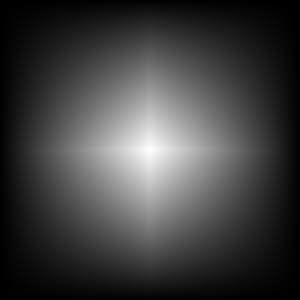
The key word in the above description is “linear”. Working in one dimension, linear interpolation between two colors works exactly the same as in the linear gradient of SVG 1. A patch corresponds to the interval between two color “stops”. The linear gradient in the following figure consists of three stops or two “patches”. The color transition between the two patches is continuous but not smooth.
Top: a three stop linear gradient. Bottom: the RGB color profile of the gradient.

Top: A three stop gradient with stop colors blue, purple, and yellow. Bottom: Plots of the red, green, and blue profiles of the gradient.

Lack of smoothness in some cases can lead to visual artifacts as illustrated in the following figure:
Six linear gradients with the second and fourth stops in different places.

Linear gradients consisting of five stops. The outer two are black, the center one is white, and the remaining two are set to 90% white. The position of the 90% white stops are different for each gradient. The red line shows the black to white profile for each gradient.

As one can see in the above linear gradients, the eye is fooled into thinking that the location of the 90% white stop is whiter than the areas immediate right and left of the stop. This is due to the Mach Banding effect. 
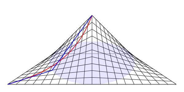
With meshes, one can move the Bézier “handles” to alter the color profile. This is equivalent to stretching or shrinking a section of the patch. If the side is linear, moving the handles will not change the shape of the patch but will change the “speed” of the curve’s parameterization. The following figure shows how moving the handles can yield a smooth transition and eliminate the Mach Banding:
Three gradients illustrating how to smooth a color transition.

The top gradient is a linear gradient. The middle gradient is a Coons Patch mesh gradient that duplicates the linear gradient. The location of the Bézier handles (circles) are shown in blue. They are at their default positions spaces one-third of the way between the corner points (squares), corresponding to a linear interpolation. The bottom gradient is a Coons Patch mesh gradient where the top and bottom handles have been moved to smooth out the transition across the patch boundaries. The 90% stop has been changed to 80%. The purple line on the bottom gradient shows the new color profile.

As illustrated above, it is possible in some cases to obtain smooth transitions with Coons Patch mesh gradients across patch boundaries. However there are cases where it is not possible. Consider the center “stop” in the above figure. No matter how you manipulate the handles you can not achieve a smooth transition at this point. The derivative of the color profile cannot be made to be zero. The following figure shows some of the profiles available for one patch:
Three gradients showing the range of allowed color profiles when moving Bézier handles.

Three Coons patch meshes are shown where the left corners are black and the right corners are white. Overlaid each gradient is the color profile determined by the handle placements of the top and bottom Bézier curves. The top gradient shows the color profile with the default handle placement (i.e. when a curve is defined by a “lineto”). The Bézier handles of top and bottom of the mesh are shown in blue while the color profile with the profile’s effective Bézier handles are shown in red. The middle gradient shows the the color profile when the handle “lengths” are zero (i.e. when the handles are placed on top of the corners. The bottom gradient shows the color profile when the handles are placed over the opposite corners.

Note that in the above figure the handles of the effective Bézier curve color profile are constrained to horizontal lines one-third of the distance between the top and bottom range of the color profile. As a result, one can never have a profile where the derivative of the color change at a boundary is zero. Also note, that while the handles can be moved outside the patch region to the left or right, a discontinuity in the color profile will result as the effective profile Bézier will overlap itself. Another case where it is impossible to obtain a smooth transition is when the different primary colors (red, green, blue) have different profiles. In general, only the profile of one color can be made smooth. So how do Adobe Illustator and Corel Draw get smooth transitions? I don’t have either one so I can’t check personally but from a paper by Sun, Liang, Wen, and Shum it appears that Adobe Illustrator and Corel Draw use a monotonic cubic spline interpolation instead of a linear interpolation. Then, when exporting to PostScript or PDF, a single Illustrator or Corel Draw patch gets exported as multiple Coons patches inorder to approximate the smooth transitions. The question then is: should the SVG standard support the Coons Patch meshes with bi-linear interpolation or should it specidfy a more complex interpolation. My inclination is to leave the interpolation as bi-linear and follow Adobe’s and Corel’s lead and let the authoring software handle smoothing out transitions when necessary. This keeps compatability with existing standards and keeps the definition of the patches simpler. More details about meshes in SVG can be found at my Coons Patche Meshes page.