SVG Working Group Meeting Report — Santa Clara (TPAC)

This post got delayed due to work on ‘units’ for the 0.91 Inkscape release followed by the holidays. The SVG Working Group had a two day meeting in Santa Clara as part of TPAC (the yearly meeting of all W3C working groups) at the end of October. This is an occasion to meet in person with other groups who have some shared interests in your group’s work. I would like to thank the Inkscape board for partially funding my attendance and W3C for waiving the conference fee. Here are some highlights of the meeting:

Day 1, Morning

Minutes The morning session was divided into two parts: the first part was an SVG only meeting while the second part was a joint meeting with the Task Force for Accessibility.
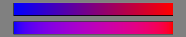
  • SVG blending when embedded via <img>:

    This is probably not a real interesting topic to readers of this blog other than it can give one a flavor of the types if discussions that go on inside the SVG working group. We spent considerable time debating if elements inside an SVG that are included into a web page by the HTML <img> tag should blend with elements outside the SVG (other than following the simple “painters model” where transparency is allowed). Recall that in SVG 2 (and CSS) it is possible to select blend modes using the ‘mix-blend-mode’ CSS property (see my blog post about blending). So the question becomes should objects like a rectangle (inside the SVG referenced by an <img> element) with a ‘mix-blend-mode’ value of say ‘screen’ blend with an image in the HTML page behind? We finally concluded that an author would expect an external SVG to be isolated and not blend with other objects in the HTML page.

  • Accessibility:

    The Accessibility Task Force asked to meet with us to discuss accessibility issues in graphics. Work has begun on SVG2 Accessibility API Mappings. An example of how accessibility can work with graphics can be found in a Surfin’ Safari blog post.

Day 1, Afternoon

Minutes The afternoon session was a joint meeting with the CSS working group.
  • Text Decoration

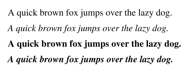
    CSS has expanded the possibilities of how text is decorated (underlines, over-lines, etc.) by adding three new properties in CSS Text Decorations Module Level 3. The new properties ‘text-decoration-line’ and ‘text-decoration-style’ are easy to adopt into SVG (and in fact are already read and rendered by Inkscape 0.91). The new property ‘text-decoration-color’ is more problematic. SVG has long supported separate ‘fill’ and ‘stroke’ properties on text which also applies to text decoration. By careful nesting of <tspan>’s one can have a different underline color from the text color. Furthermore, SVG allows various paints to be applied to the text decoration, like a gradent or pattern fill. The ‘text-decoration-color’ property allows the color of the text decoration to be set directly, without the need for nested <tspan>’s so it is a quite attractive idea but how to support the richness found in SVG?

    I proposed a number of solutions (see my presentation). The CSS group agreed that my favorite solution, that adding ‘text-decoration-fill’ and ‘text-decoration-stroke’ was the proper way to move forward. (BTW, the CSS working would like to eventually allow fill and stroke on HTML text.)

  • Fitting Text in a Box

    We’ve had numerous requests for the ability to adjust the size of text to fit it inside a given box (note, this is not the same as wrapping text into a shape). SVG has the attribute ‘textLength’ which allows a renderer to adjust the spacing or glyph width to match text to a given length. It was intended to allow renderers to adjust the length of a given text string to account for differences in font metrics if a the specified font wasn’t available; it was never intended to be an overall solution to fitting text inside a box, in fact the SVG 2 spec currently warns against using it in this way. I received a proposal from another Inkscape developer on expanding ‘textLength’ to be more useful in fitting text in a box. It seems to me that finding a solution to this problem would be of more general interest than just for SVG so I added this topic to the SVG/CSS agenda. I prepared a presentation to provide a starting point for the discussion.

    We had quite a lengthy discussion. The consensus seemed to be that CSS could use a set of simple knobs to make small adjustments to text, mostly for the purpose of labels. This would satisfy most use cases. Large adjustments could (should?) be the domain of script libraries. It was decided to solicit more feedback from users.

  • Image Rendering

    CSS Images 3 has co-opted the SVG ‘image-rendering‘ property and redefined in to specify what about an image is important to preserve when scaling as compared to a speed/accuracy trade off as in SVG 1.1. I prepared a short report on a couple of issues I found. The first is that the specification does not describe very well the meaning of the new ‘crisp-edges’ value. Tab Atkins, one of the spec’s authors has agreed to elaborate and add some figures to demonstrate what is intended. I found the Wikipedia section Pixel art scaling algorithms to be particularly enlightening on the subject.

    The second issue is that some browsers and Inkscape use the now deprecated ‘optimizeSpeed’ value to indicate that the nearest neighbor algorithm should be used for scaling. This is important when scaling line art. I asked, and Tab agreed, that ‘optimizeSpeed’ value should correspond to the new ‘pixelated’ value to not break existing content (and not ‘auto’ as is currently in the spec).

  • Connectors

    I’ve been working on a connectors proposal for SVG. There is renewed interest as being able to show relationships between elements would greatly aid accessibility. We even had a brief meeting with the HTML working group where it was suggested that connectors (possibly without visual links) may be of interest to aid accessibility of HTML. One problem I’ve had is how to reference ports inside a <symbol> element. I asked the CSS group for suggestions (this is obviously not a styling issue but the CSS group members are experts at syntax). Tab Atkins suggested: url(#AndGate1) Out, Mid1, Mid2, url(#AndGate2) InA, where, for example, Out is the point defined inside the symbol with the ‘id’ AndGate1.

Day 2

Minutes The SVG working group met for entire day covering a real hodge-podge of topics, some not well minuted. Here are a few highlights:
  • NVidia presentation.

    NVidia gave a quite impressive demonstration of their OpenGL extensions for rendering 2D vectors, (think SVG), showing an entire HTML web page from the New York Times being rotated and scaled in real time on their Tegra based Shield tablet with all the text rendered as vectors (they can render 700,000 paths per second). They are trying to get other vendors interested in the extensions but it doesn’t seem to be a high priority for them.

  • CTM Calculations

    For mapping applications, a precision of greater than single precision is necessary for calculating the Current Transformation Matrix (CTM) due to rounding errors. It was proposed and accepted that SVG dictate that such calculations be done as double precision (as Inkscape already does). (Note: single precision is sufficient for actual rendering.)

  • Going to Last Call Working Draft

    We discussed when we’ll get SVG 2 out the door. It is a very large specification with various parts in various stages of readiness. We decided to target the February face-to-face meeting in Sydney as the date we move to the next stage in the specification process… where no new features can be added and incomplete ones removed.

  • HTML in SVG

    There has been a desire by some for quite awhile to allow HTML directly inside SVG (not wrapped by a <foriegnElement> tag). I personally am quite hesitant to see this happen. SVG as at the moment a nice stand-alone graphics specification that doesn’t necessarily have to be rendered in a Web browser. Incorporating HTML would threaten this.

  • SVG in HTML

    This is the opposite of the previous topic, allowing SVG to be directly embedded in HTML without using a name space.

  • Non-scaling Patterns

    Just as it often useful to have non-scaling stroke widths (especially for technical drawings), it would also be useful to have non-scaling patterns and hatches. We agreed that this should be added to the specification.

  • Minimum Stroke Width

    It would be useful to have a minimum stroke-width so that certain strokes do not disappear when a drawing is scaled down. It was claimed that this will be handled by vector-effect but I don’t see how.

  • SVG in Industry

    It was mentioned that Boeing is moving all their 787 docs to SVG so they can be viewed in browsers.

Unfortunately, we ran out of time before we could cover some of my other topics: stroke-miterlimit, text on a shape, and auto-path closing.

Descending into the bowels of Inkscape code

Introduction

This post is more geared to Inkscape developers than Inkscape users. I hope that by recording my trials and tribulations here it can help others in their coding efforts. I have been working on adding support for ‘context-fill’ and ‘context-stroke’ to Inkscape. These magical ‘fill’ ans ‘stroke’ property values will allow Inkscape to finally match marker fill (e.g. arrowhead color) to path stroke (e.g. arrow tail) in a simple way. These new property values are part of SVG 2. Adding this support is a multi-step process. First one must be able to read the new values and then one must be able to apply the values. The former part is rather straight forward. It simply required modifying the SPIPaint class by adding a new ‘enum’ SPPaintOrigin with entries that keep track of where the paint originates. The previous ‘currentColor’ boolean has been incorporated into this new ‘enum’. The latter part proved to be much more of a challenge.

Where does the ‘apply’ code go?

The ‘context-fill’ and ‘context-stroke’ values are applicable to things that are cloned. The driving force for these values is certainly the <marker> element but <symbol> and <pattern> elements could also find the values useful as could anything cloned by the <use> element. For the moment, I concentrated on implementing the values in markers and things cloned by the <use> element. The first question that comes to mind is: Where in the code is styling applied? This turns out to not be best starting question for cloned objects. A better question is: How does the cloning take place? To answer this question I implemented three routines with the same name: recursivePrintTree(); but, as member functions of different classes: SimpleNode, SPObject, and DisplayItem. These represent different stages in Inkscape’s processing of an SVG document. Here are the findings:
XML Tree (SimpleNode)
The XML Tree matches the structure of the XML file with some extra elements possibly added by Inkscape such as <metadata> and <sodipodi:namedview>. This is the tree that is shown in the XML editor dialog. No cloning is evident.
Object Tree (SPObject)
The object tree is similar to the XML tree. Its main purpose is to handle the CSS styling which involves merging the various sources of styling (external style sheets (rect: {fill:red;}), styling properties (style=”fill:red”), and presentation attributes (fill=”red”), as well as handling all the necessary cascading of styles from parent to child. A few non-rendering elements are missing such as <RFD:rfd> and some new elements appear. Here is our first clue: the object tree includes the unnamed clones of elements created by the <use> element. It makes sense that they appear here. Cloned objects descending from a <use> element participate in the style cascading process. Marker clones, however, are no where to be seen.
Display Tree (DisplayItem)
The display (or rendering) tree includes only elements that will be rendered. All the styling has been worked out; all the placement and sizing of graphical items has been calculated. The metadata, the Inkscape editing data, and the <defs> section are all gone. But now clones of the markers appear, one clone for each node where a marker is placed, each containing the geometric data of position, scale, and orientation. This is a quite reasonable way to handle markers as each marker clone is identical to its siblings (at least until ‘context-fill’ and ‘context-stroke’ came along).
The above “tree” analysis gives the structure of each tree after it has been built, but doesn’t explain how each tree is created. This has ramifiations of how one can handle the ‘context-fill’ and ‘context-stroke’ values.

Creating the XML tree

There are a couple of ways to create the XML tree. The most common is via sp_repr_read_file(). This is used in SPDocument::createNewDoc() as well as routines to read in filters, templates, etc. Files opened by Inkscape from the command line use XSLT::open() which allows XSLT stylesheets to be applied to the SVG file (something I didn’t know we supported). Both functions call sp_repr_do_read() to read the actual files and both end up with an Inkscape::XML::Document.

Creating the object tree

Once the XML tree is created, it is passed to SPDocument::creatDoc() which builds the object tree top down via the recursive calling of SPObject::invoke_build() starting with the document root <svg> element. SPObject::invoke_build() calls the virtual function SPObject::build() which handles element specific things such as reading in attributes. Attributes are read by calling SPObject::readAttr() which performs a few checks before calling the virtual SPObject::set() function. The set() function for SPUse reads in ‘href’, the reference to the object to be cloned by the <use> element. Reading in the reference inserts a copy of the referenced object (the clone) into the object tree via SPUse::href_changed(). Markers are not cloned; only references to the marker elements are added at this step, in the SPShape::build() function.

Creating the display tree

The display tree is created by calling recursively SPItem::invoke_show() on the root object (SPItem, derived from SPObject, is for visible objects). This is done in SPDesktop::setDocument(). SPItem::invoke_show immediately calls the virtual function SPItem::show() which handles element specific things. (SPRoot::show() calls SPGroup::show() which calls SPGroup::_showChildren.) SPItem::show() creates an instance of an appropriate display class object that is derived from Inkscape::DrawingItem(). The virtual function DrawingItem::setStyle() is called to set the style information. One thing to note is that the a child is constructed (with styling) before adding it to the tree so a child’s style cannot be directly dependent on an ancestor in the tree. But ‘context-fill’ and ‘context-stroke’ need ancestor style information so we need to supply that in a different way. Markers are tracked by a map of vectors of pointers to Inkscape::DrawingItem instances. This map is stored in SPMarker. The map is indexed by a key for each type of marker (start, mid, end) on a particular path. The vector has an entry for each position along the path a marker is to be placed. The DrawingItem instances are created in a two step process from SPShape::show(). First a call to sp_marker_show_dimensions() ensures that the vector is of the correct size. Then a call to sp_shape_update_marker_view() calls sp_marker_show_instance() which creates a new Inkscape::DrawingItem instance if it doesn’t already exist.

Setting the style of a clone

As mentioned above, style is handled in the virtual function DrawingItem()::setStyle(). The DrawingShape and DrawingText setStyle() functions call NRStyle.set() where the work of translating the style information from the object tree form to the display tree form takes place (in the display tree, the styling information is in a form used by the Cairo rendering library). To handle ‘context-fill’ and ‘context-stroke’ we would like to walk up the display tree to find the style of the element that references the clone, i.e. the <use> element or the <path> or <shape> elements in the case of markers. But at the point the setStyle() function is called on an element in the clone, the clone has not yet been inserted into the display tree, so one cannot walk up the display tree. What we can do is hand two sets of styling information from the object tree to to the setStyle() function, the first being the stying information for the object at hand and the second being the styling information that should be used in the case of ‘context-fill’ and ‘context-stroke’. We know the later for the <use> element as its clone is in the object tree. All that is required is setting a pointer to the context style information in the SPUse class and then passing it down to its children. This solution doesn’t work for markers as their clones are not in the object tree. The solution for markers is calling a function that walks down the tree setting the correct styling information after the cloned marker elements are added to the display tree.

Future work

There are still quite a few things to be done. In particular, before we can switch to using ‘context-fill’ and ‘context-stroke’, as well as the ‘orient’ attribute value ‘auto-start-reverse’ (which allows us to handle both start and end arrows with just one marker) we’ll need a fallback solution for SVG 1.1 renderers. Here is a list of things to do:
  • Handle gradients and patterns.
  • Handle text (appendText()).
  • Export to SVG 1.1.
  • Redo markers.svg (source of markers in Inkscape).

Reflections

All the code is now in trunk. To implement ‘context-fill’ and ‘context-stroke’, I added about 200 lines of code. I don’t know the exact amount of time it took, but I would guess a minimum of 20 hours. That works out to about 10 lines per hour… not very productive. The first part, reading in ‘context-stroke’ and ‘context-fill’ took about an hour. I am quite familiar with this part of the code, having C++ified the SPStyle and related classes and having implemented other new properties and property values. It was the second part that took so long. Although I have worked with parts of this code before, it was often quite opaque as to which code is doing what (and why). I ended up going down many false paths. There is a serious lack of comments and often confusing variable and function names (what the heck is an ‘arenaitem’?). A few comments at the appropriate places could have shaved up to 90% of the time it took. In this case, the different way markers and clones are handled required solving the same problem twice. When you begin a project, it is very hard to estimate the time it will take. I would have thought this project could be done in less than 5 hours, possibly in just a couple. It didn’t turn out that way. On the otherhand, implementing the new CSS property ‘paint-order’ which I thought would take considerable time, took only a couple of hours.

SVG Working Group Meeting Report — London

The SVG Working Group had a four day Face-to-Face meeting just before The Graphical Web conference in Winchester (UK). The meetings were hosted by Mozilla in their London office. Here are some highlights of the meeting:

Day 1

Minutes
  • Symbol and marker placement shorthands:

    Map makers use symbols quite extensively. We decided at a previous meeting to add the ‘refX’ and ‘refY’ attributes (from <marker>) to <symbol> so that symbols can be aligned to a particular point on a map without having to do manual position adjustments. We have since been asked to provide ‘shorthand’ values for ‘refX’ and ‘refY’. I proposed adding ‘left’, ‘center’, and ‘right’ to ‘refX’ (defined as 0%, 50%, and 100%) of the view box as well as ‘top’, ‘center’, and ‘bottom’ to ‘refY’. These values follow those used in the ‘transform-origin’ property. We debated the usefulness and decided to postpone the decision until we had feedback from those using SVG for maps (see Day 4).

    For example, to center a symbol at the moment, one has to subtract off half the width and height from the ‘x’ and ‘y’ attributes of the <use> element:

      <symbol id="MySquare" viewBox="0 0 20 20">
        <rect width="100%" height="100%"
    	  style="fill:none;stroke:black;stroke-width:2px"/>
      </symbol>
      <use x="100" y="100" width="100" height="100"
           xlink:href="#MySquare"/>
    

    By using ‘refX’ and ‘refY’ set to ‘center’, one no longer needs to perform the manual calculations:

      <symbol id="MySquare" viewBox="0 0 20 20"
                      refX="center" refY="center">
        <rect width="100%" height="100%"
    	  style="fill:none;stroke:black;stroke-width:2px"/>
      </symbol>
      <use x="150" y="150" width="100" height="100"
                 xlink:href="#MySquare"/>
    
    A square symbol centered in an SVG.

    An example of a square <symbol> centered inside an SVG.

  • Marker and symbol overflow:

    One common ‘gotcha’ in using hand-written markers and symbols is that by default anything drawn outside the marker or symbol viewport is hidden. People sometimes naively draw a marker or symbol around the origin. Since this is the upper-left corner of the viewport, only one quarter of the marker or symbol is shown. We decided to change the default to not hide the region outside the viewport, however, if this is shown to break too much existing content, the change might be reverted (it is possible that some markers/symbols have hidden content outside the viewport).

  • Two triangle paths with markers on corners. Only one-fourth of each marker on the left path is shown.

    Example of markers drawn around origin point. Left: overflow=’hidden’ (default), right: overflow=”visible’.

  • Variable-stroke width:

    Having the ability to vary stroke width along a path is one of the most requested things for SVG. Inkscape has the Live Path Effect ‘Power Stroke’ extension that does just that. However, getting this into a standard is not a simple process. We must deal with all kinds of special cases. The most difficult part will be to decide how to handle line joins. (See my post from the Tokyo meeting for more details.) As a step towards moving this along, we need to decide how to interpolate between points. One method is to use a Centripital Catmull-Rom function. Johan Engelen quickly added this function as an option to Inkscape’ Power Stroke implementation (which he wrote) for us to test.

Day 2

Minutes
  • Path animations:

    In the context of discussing the possibility of having a canonical path decomposition into Bezier curves (for speed optimization) we briefly discussed allowing animation between paths with different structures. Currently, SVG path animations require the start and end paths to have the same structure (i.e. same types of path segments).

  • Catmull-Rom path segments.

    We had a lengthy discussion on the merits of Catmull-Rom path segments. The main advantage of Catmull-Rom paths is that the path goes through all the specified points (unlike Bezier path segments where the path does not go through the handles). There are some disadvantages… adding a new segment changes the shape of the previous segment, the paths tend not to be particularly pretty, and if one is connecting data points, the curves have the tendency to over/under shoot the data. The majority of the working group supports adding these curves although there is some rather strong dissent. The SVG 2 specification already contains Catmull-Rom paths text.

    After discussing the merits of Catmull-Rom path segments we turned to some technical discussions: what exact form of Catmull-Rom should we use, how should start and end segments be specified, how should Catmull-Rom segments interact with other segment types, how should paths be closed?

    Here is a demo of Catmull-Rom curves.

Day 3

Minutes
  • <tref> decission:

    One problem I see with the working group is that it is dominated by browser interests: Opera, Google (both Blink), Mozilla (Gecko), and Adobe (Blink, Webkit, Gecko). (Apple and Microsoft aren’t actively involved with the group although we did have a Microsoft rep at this meeting.) This leaves those using SVG for other purposes sometimes high and dry. Take the case of <tref>. This element is used in the air-traffic control industry to shadow text so it is visible on the screen over multi-color backgrounds. Admittedly, this is not the best way to do this (the new ‘paint-order’ property is a perfect fit for this) but the fact is that it is being used and flight-control software can’t be changed at a moments notice. Last year there was a discussion on the SVG email list about deprecating <tref> due to some security issues. From reading the thread, it appeared the conclusion was reached that <tref> should be kept around using the same security model that <use> has.

    Deprecating <tref> came up again a few weeks ago and it was decided to remove the feature altogether and not just deprecate it (unfortunately I missed the call). The specification was updated quickly and Blink removed the feature immediately (Firefox had never implemented it… probably due to an oversight). It has reached the point of no-return. It seems that Blink in particular is eager to remove as much cruft as possible… but one person’s cruft is someone else’s essential tool. (<tref> had other uses too, such as allowing localization of Web pages through a server.)

  • Blending on ‘fill’ and ‘stroke':

    We have already decided to allow multiple paint servers (color, gradient, pattern, hatch) on fills and strokes. It has been proposed that blending be allowed. This would follow the model of the ‘background-blend-mode’ property. (Blending is already allowed between various element using the ‘mix-blend-mode’ property’, available in Firefox (nightly), Chrome, and the trunk version of Inkscape.)

  • CSS Layout Properties:

    The SVG attributes: ‘x’, ‘y’, ‘cx’, ‘cy’, ‘r’, ‘rx’, ‘ry’ have been promoted to properties (see SVG Layout Properties). This allows them to be set via CSS. There is an experimental implementation in Webkit (nightly). It also allows them to be animated via CSS animations.

A pink square centered in SVG if attributes supported, nothing otherwise.

A test of support of ‘x’, ‘y’, ‘width’, and ‘height’ as properties. If supported, a pink square will be displayed on the center of the image.

Day 4

Minutes
  • Shared path segments (Superpaths):

    Sharing path segments between paths is quite useful. For example, the boundary between two countries could be given as one sub-path, shared between the paths of the two countries. Not only does this reduce the amount of data needed to describe a map but it also allows the renderer to optimize the aliasing between the regions. There is an example polyfill available.

    We discussed various syntax issues. One requirement is the ability to specify the direction of the inserted path. We settled for directly referencing the sub-path as d=”m 20,20 #subpath …” or d=”m 20,20 -#subpath…”, the latter for when the subpath should be reversed. We also decided that the subpath should be inserted into the path before any other operation takes place. This would nominally exclude having separate properties for each sub-path but it makes implementation easier.

  • Here, MySubpath is shared between two paths:

      <path id="MySubpath" d="m 150,80 c 20,20 -20,120 0,140"/>
      <path d="m 50,220 c -40,-30 -20,-120 10,-140 30,-20 80,-10
                       90,0 #MySubpath c 0,20 -60,30 -100,0 z"
    	style="fill:lightblue" />
      <path d="m 150,80 c 20,-14 30,-20 50,-20 20,0 50,40 50,90
                       0,50 -30,120 -100,70 -#MySubPath z"
    	style="fill:pink" />
    
    This SVG code would render as:
    Two closed paths sharing a common section.

    The two closed paths share a common section.

  • Stroke position:

    An often requested feature is to be able to position a stroke with some percentage inside or outside a path. We were going to punt this to a future edition of SVG but there seems to be quite a demand. The easiest way to implement this is to offset the path and then stroke that (remember, one has to be able to handle dashes, line joins, and end caps). If we can come up with a simple algorithm to offset a stroke we will add this to SVG 2. This is actually a challenging task as an offset of a Bezier curve is not a Bezier… thus some sort of approximation must be used. The Inkscape ‘Path->Linked Offset’ is one example of offsetting. So is the Inkscape Power Stroke Live Path Effect (available in trunk).

  • Symbol and marker placement shorthands, revisited:

    After feedback from mappers, we have decided to include the symbol and marker placement shorthands: ‘left’, ‘center’, ‘right’, ‘top’, and ‘bottom’.

  • Units in path data:

    Currently all path data is in User Units (pixels if untransformed). There is some desire to have the ability to specify a unit in the path data. Personally, I think this is mostly useless, especially as units (cm, mm, inch, etc.) are useless as there is no way to set a preferred pixel to inch ratio (and never will be). The one unit that could be useful is percent. In any case, we will be investigating this further.

Lots of other technical and administrative topics were discussed: improved DOM, embedding SVG in HTML, specification annotations, testing, etc.

The ‘paint-order’ property in SVG 2

Introduction

SVG 2 has a new ‘paint-order’ property which can be used to select the order in which the fill, stroke, and markers are painted. This is of especially great use for text where having the stroke painted on top of the fill leads to distorted glyphs.
Sample text showing effect of paint-order.

Sample text showing the effect of the ‘paint-order’ property.

As of March 2014, Chrome and Firefox Nightly support the ‘paint-order’ property. Inkscape trunk also has rendering support for the property (if compiled in).

Test SVGs

Tests with different orders of 'fill', 'stroke', and 'markers'.

Each square has the indicated value of the ‘paint-order’ property.

Tests with different orders of 'fill', 'stroke', and 'markers'.

Each line of text has the indicated value of the ‘paint-order’ property.

Blending coming to an SVG renderer near you! (Including Inkscape)

SVG has supported a limited set of blend modes through the use of SVG filters. Now SVG (and HTML) are getting a full set of blend modes that can be directly applied to all graphical objects. Chrome already has some support for the new blending method. Here is a snippet of SVG from the specification CSS Blending and Compositing Level 1:
<svg>
  <rect width="120" height="120" fill="black"/>
  <circle cx="40" cy="40" r="40" fill="red"/>
  <circle cx="80" cy="40" r="40" fill="lime"/>
  <circle cx="60" cy="80" r="40" fill="blue"/>
</svg>
Normally, SVG uses the painter’s model where each element is painted on top of the previous. So the above SVG gets rendered as (actual inline SVG):

Inlined SVG. Circles drawn using painter’s model.

With CSS blending, one can specify how the blending between the elements is done by setting the ‘mix-blend-mode’ property. The following style rule: circle { mix-blend-mode: screen; } yields the following figure:

Inlined SVG. Circles blended with ‘mix-blend-mode’ = ‘screen’.

which in a browser (recent Chrome) that supports CSS blending should look like this:
Red, lime, and blue overlapping circles, blended with 'screen' mode.

PNG.

Why the black background? If the background was white, the circles would not be visible. This is because the circles blend not only with each other but also with the background. (With the ‘screen’ blending mode, any color blended with a white background results in white.) To stop blending with the background, one can use the ‘isolation’ property. By wrapping the three circles in a group and setting the ‘isolation’ property to ‘isolate’, the three circles are first blended onto a transparent, black background and then the resulting image is painted normally. The code looks like this:
<svg>
  <g>
    <circle cx="40" cy="40" r="40" fill="red"/>
    <circle cx="80" cy="40" r="40" fill="lime"/>
    <circle cx="60" cy="80" r="40" fill="blue"/>
  </g>
</svg>
and the CSS: circle { mix-blend-mode: screen; } g { isolation: isolate; } The resulting image should look like this:
Red, green, and blue overlapping circles, blended with 'screen' mode.

PNG.

I wasn’t able to get the ‘isolation’ property to work with Chrome (which should support it), thus I used a PNG in the above figure. At the SVG Working Group meeting last week, the group approved moving the CSS Compositing and Blending Level 1 to a Candidate Recommendation. Since this a joint specification, the CSS Working group must also give their approval. A Candidate Recommendation is the last step before becoming a Recommendation (i.e. an official W3C specification). During this last step two things must happen. First a comprehensive test suite must be written and second at least two different implementations must pass the tests for each feature in the specification. This latter requirement ensures that the specification is clear enough that it can be implemented (and also demonstrates there is a real interest in the specification). Chrome already implements the specification so just one more implementation is needed. It is expected that Firefox will soon support the specification. There is also a test plan that includes SVG tests. So we are well on the way to getting this through the last step. In addition, I’ve also just added support for CSS Blending to Inscape trunk. For the moment, a compile time flag must be set to enable the support. There is no GUI (other than the XML editor) and there is still a bit of work to be done (the Inkscape canvas background needs to be isolated from the drawing and I’ve seen a bug when part of the drawing is cached. The CSS Compositing and Blending Level 1 specification also include a full set of Porter-Duff compositing operators. For the moment, they only apply to Canvas. It was intended that they apply to HTML and SVG but the rendering models used by browsers cannot yet accomodate them. They will be included in the next version of the specification, CSS Compositing and Blending Level 2. The SVG working group approved the start on the next level at the last meeting. Blending and compositing has been included in SVG filters from the beginning. However, only a limited set of blending modes and compositing operators are available in SVG filters. Unfortunately, CSS Filters Level 1 has not extended filters to include the new blending modes and compositing operators despite being trivial to implement once the original set has been implemented (it took me all of an hour to add them to Inkscape trunk). Again the motivation is to speed up approval of the level 1 specification; level 2 will include them. Work on level 2 is expected to begin early next year. If you are interested in playing with then new blending modes and compositing modes in Inkscape, check out Inkscape trunk and set the flags WITH_CSSBLEND and/or WITH_CSSCOMPOSITE (see the file configure.ac). As mentioned above, there is no GUI for the new non-filter based blending modes. The new blending modes and compositing operators for filters are available through the Filters dialog. You can also have a look at my Blending Test Page.

SVG Working Group Meeting Report — Tokyo

The SVG Working Group had a three day Face-to-Face meeting in Tokyo at the beginning of June. The first two days (hosted by Mozilla) were devoted to SVG proper while the third day (hosted by Google) was a joint meeting with the CSS Working Group. As typical, a lot of time was devoted to nitty-gritty details that only browser coders could love but there were still plenty of things of interest for artists and their brethren:
  • Wrapped text: I presented a proposal based on using the CSS Exclusions and CSS Shapes specifications. As I wrote earlier, the current Level 1 version of these specifications are missing the exact features we need, namely “shape-inside” (to provide a wrapping context) and references to SVG elements; both were recently removed. However, when we met with the CSS working group we were told that they would be back in the Level 2 specs. Alan Stearns promised to get the Level 2 drafts out soon so we have something to reference.

    Doug Schepers presented his idea on a simple way to provide a rectangular wrapping context which would not require CSS Exclusions or CSS Shapes:

     <text x="20" y="30" width="200"
        font-size="20px"
        alignment-baseline="top">This text wraps at 200 pixels.<text>
    
    Horizontally wrapped text inside box 200 px wide.

    Horizontally wrapped text.

    Or for vertical text:
     <text x="20" y="30" height="200"
        font-size="20px"
        alignment-baseline="text-before-edge">テキストは
           10文字の後に折り返されます。<text>
    
    Vertically wrapped text inside box 200 px high.

    Vertically wrapped text.

    Specifying only the “width” or the “height” creates an infinitely long rectangle for wrapping text. Specifying both creates a finite rectangle. The visibility of text that overflows this finite rectangle is controlled by the overflow property. One small problem with Doug’s proposal is that the values of “x” and “y” normally refer to the baseline of the first line of text and not the upper left corner of the rectangle wrapping area. This can be changed by specifying the “alignment-baseline” property to top or text-before-edge. Note that Doug’s proposal and my proposal are not mutually exclusive and we will mostly like incorporate both. Both the SVG and CSS working groups are amenable to the proposals. There are some details to work out. For example, in my initial proposal one would specify that text should flow sequentially into two different objects by giving a comma separated list: shape-inside=”url(#shape1), url(#shape2)”. This, I am told, won’t work as in CSS it indicates that the text should flow into the two shapes as if they were one shape. Instead, it has been suggested that either CSS Regions and/or CSS Fragments be used. This, however, seems overly complex.

  • Variable width stroke: We discussed various aspects of variable width strokes. It is clear that it will take some work to come up with a good specification. Problems include: how to specify positions, widths, smoothing, line joins, and end caps. Whether or not this gets into SVG 2 will depend on how fast these issues are resolved and in the timing of SVG 2. It it doesn’t get into SVG 2, it certainly will get into the next version. For example, here are some possible ways of drawing a “round” stroke-linejoin:

    Possible ways to draw a “round” stroke-linejoin when there is a discontinuity in line width at a corner node. Top: using a “pen” with diameter of the smallest width. Bottom: using an ellipse.

    Circles and ellipses work well when the two line segments intersect at 90 degrees. At other angles or when the line widths are changing they aren’t as useful. Here is an attempt at using a Bezier with a handle length chosen so that it matches a “round” stroke-linejoin when the width is constant.

    Possible way to draw a “round” stroke-linejoin: using a Bezier curve. The handle length is calculated so that it reduces to a circular arc when the width is constant (length is 0.552 × angle between tangents in degrees / 90 × distance from end to intersection of tangents). The handles are shown in purple.

    Here is a challenge: Come up with a method that produces a suitable “round” stroke-linejoin in each of the following cases:
    Figures with various angles between the two path sections.

    A triangle shape is applied to a path with two sections. The angle between the two sections is changed from figure to figure. How would you construct a “round” stroke-linejoin between the two sections that works in all cases?

  • Marker rendering issues: SVG renderers differ on how markers are rendered for corner cases such as a polyline with one point (see: http://paullebeau.com/svg2/markers/). We sorted out the details. As part of the discussion, we agreed that markers should apply to rectangles, ellipses, and circles (and in the future stars). The basic rule, is that markers are drawn as if these shapes were rendered as paths. We explicitly decided that circles and ellipses would have four markers.
    Marks shown on a rectangle, rounded rectangle, circle, and ellipse.

    Markers drawn on various shapes.

  • New value for the marker property orient: “auto-start-reverse”: This value indicates that a marker should be reversed if it is at the start of a path. This is so that one needs to define only one marker (like an arrowhead) and use it both as a start and an end marker (like a double-headed arrow). This has already been added to the spec and is in the process of being implemented in Firefox.
      <defs>
       <marker id="MyArrowHead"
          viewBox="0 0 10 10" refX="0" refY="5" 
          markerUnits="strokeWidth"
          markerWidth="4" markerHeight="3"
          orient="auto-start-reverse"
          fill="black">
          <path d="M 0 0 L 10 5 L 0 10 z" />
        </marker>
      </defs>
      <path marker-start="url(#MyArrowHead)"
            marker-end="url(#MyArrowHead)"
           d="m 75,75 150,0" />
    
    Double headed arrow using auto-start-reverse.

    Path with just one defined marker using orient=”auto-start-reverse”.

  • Hatch patterns: I recently added hatch patterns to the SVG 2 specification. The work was approved with a few small changes (renaming a property and specifying that only solid colors can be used… no hatches inside hatches!).
  • Multiple fill and stroke properties: As part of our discussion of hatch patterns, we discussed the ability to specify multiple fill and stroke properties. This is useful, for example, to draw a hatch over a gradient fill, or in drawing cross-hatching. We agreed to how this would be specified. This is a first step to allowing things like multiple stroke widths and colors on paths but at the moment there is some resistance to handling these more complicated cases. The feeling is that we need to start limiting what is being added to SVG 2 so that we can get it finished.
      <defs>
       <hatch id="MyHatch1" ... >
       <hatch id="MyHatch2" ... >
      </defs>
      <rect x="50" y="50" width="200" height="200"
         fill="url(#MyHatch1),url(#MyHatch2),#a0a0ff"</rect>
    
    A simple cross hatch over a light blue fill.

    A multiple fill consisting of two hatch patterns over a solid light blue fill”.

  • Filter compositing: feBlend: As anybody who has used the feBlend filter primitive to blend an element with transparency with a background image knows that the background gets added twice, once with the blending and once when the blend result is composited with the background. (See my example.) We can’t change the behavior of feBlend as there is too much content out there that uses it. We did agree to add a new attribute that will allow turning off compositing.

Flowed text in SVG: One step forward, one step back.

Background

The ability to flow text into an arbitrary shape or even a simple box has been a feature long in demand in SVG. Thus it is on the list of required features for SVG 2.[1] The SVG 1.2 draft specification[2] included the ablility to flow text (and graphics!) into arbitrary shapes. Unfortunately, SVG 1.2 never got off the ground and only Inkscape and Batik seem to have implemented parts of flowed text. Inkscape’s implementation supports text flowed into arbitrary paths. If the path has a hole, text will wrap around it. Inkscape also supports text flowed into multiple shapes. Inkscape (nor Batik) implemented flowing images or some of the fancier elements that control line and paragraph breaks.
Text flowed inside a Chinese coin. Text wraps around hole.

Text flowed into a Chinese Coin. Done in Inkscape.

Text flowed into three circles.

Text flowed into three circles. Done in Inkscape.

Flowed text in SVG 1.2 does have some problems. First, it is complicated. There are eleven separate elements (Inkscape supports five, Batik seven). Second, there is some missing functionality. For example, there is no way to set a margin (as seen in the above examples). Third, the reality is that none of the browsers will implement SVG 1.2 flowed text even if it were part of SVG 2. They want a solution that works for both HTML and SVG.

Enter CSS and a step forward

Almost nine years after the SVG 1.2 draft came out, interest in flowing text into and around shapes has made it to HTML. The CSS working group has produced a draft specification[3] for text flowing and wrapping. The specification is fairly simple and straight forward. One specifies shapes to flow text into (‘shape-inside’) and shapes to flow text around (‘shape-ouside’). Then one specifies how the text should wrap (e.g. only wrap on the left side of a ‘shape-outside’ shape) and how close the text should come to the shapes (‘wrap-margin’ for outside shapes and ‘wrap-padding’ for inside shapes). There are a set of canned shapes defined (rectangle, circle, ellipse, or polygon) or one can link to an SVG shape or path. One can also use the alpha value of an image to generate a shape. With this, 95% of the work for getting text wrapping in SVG is done. A few small changes are needed to adapt to the spec to SVG. For example, in HTML, one always has a box to provide a ‘wrapping-context’. In SVG you must supply the wrapping context using the ‘shape-outside’ property. In SVG, you might want to limit shapes to actual SVG shapes or paths (rather than using the canned shapes). SVG would need to add the value ‘justified’ to ‘text-align’ and add the property ‘line-height’ (already defined in CSS). The ‘x’ and ‘y’ attributes on <text> and <tspan> would be ignored (but left for use as a fallback). The trickiest part is figuring out how SVG would specify linebreaks and paragraphs since SVG does not have the <br/> and <p></p> elements. Here is a simple example of how CSS Exclusions might work in SVG:
<def>
  <circle id="mycircle" cx="150" cy="150" r="125"/>
</def>
<text x="100" y="100" font-size="18px" text-align="justified"
       line-height="125%" wrap-margin="25"
       shape-inside="url(#myshape)">This is a mockup of...</text>
Text flowed using CSS Exclusions.

Text flowed into circle using CSS Exclusions.

And one step back

I just knocked off adding hatches to SVG 2 this week and was ready to take a closer look at text wrapping so I could present a plan for its specification at the upcoming SVG Working Group meeting. I looked at the lastest CSS Exclusions public working draft and started formulating a plan. Things looked easy. But then, a few days ago, it was announced on the CSS Working Group mailing list that the CSS Exclusions draft had been split into an Exclusions specification[4] and a Shapes specifications[5]. This seemed OK at first but in looking at the current editor’s drafts (a step before publishing a public working draft) I noticed two problems. In the Exclusions editors draft ‘shape-inside’ had been removed, to be postponed to a future specification; and in the Shapes draft, it was no longer possible to reference SVG shapes and paths. These are the VERY two things that are most required for having flowed text in SVG are gone. Hopefully we can get these back.
  1. SVG 2 Requirement.
  2. SVG 1.2 Working Draft (27 October 2004.
  3. CSS Exclusions Working Draft (3 May 2013).
  4. CSS Exclusions Editor’s draft (22 May 2013).
  5. CSS Shapes Editor’s draft (20 May 2013).

Inkscape and Font Faces, a drama featuring SVG, Pango, and others.

I have just disabled “faux” or “synthesized” font faces in Inkscape trunk. The post explains why.

Background

Fonts often come in groups of related faces that all belong to the same family. For example, the group for the family ‘Nimbus Roman No9 L’ consists of the faces Regular, Regular Italic, Medium, and Medium Italic.[1]
Four lines of text showing the four different faces.

The four faces of ‘Nimbus Roman No9 L’. From top to bottom: Regular, Regular Italic, Medium, and Medium Italic.

Font designers take a lot of time to create the different faces. This can be illustrated by comparing individual characters between the faces.
Comparison of the letters 'a', 'f', 'l', 'v', 'z', and 'Q'.

Comparison between the Regular and Regular Italic faces of ‘Nimbus Roman No9 L’. Note how the font designer customized the different characters.

Comparison of the letters 'O', 'X'.

Comparison between the Regular and Medium faces of ‘Nimbus Roman No9 L’. Note that the Medium glyphs (black) are not just thickened versions of the Regular glyphs (red outline). In fact, the top and bottom of the bolder ‘O’ are actually thinner.

Font Faces and SVG

Since Inkscape uses SVG as its native file format, we need to take a quick look at how SVG describes font faces. SVG 1.1 (which for fonts is basically the same as CSS 2.1 ) defines the following font-selection properties:
  • font-family.
  • font-style: normal, italic, oblique.
  • font-variant: normal, small-caps.
  • font-weight: normal, bold, bolder, lighter, 100, 200, 300, 400, 500, 600, 700, 800, 900.
  • font-stretch: normal, wider, narrower, ultra-condensed, extra-condensed, condensed, semi-condensed, semi-expanded, expanded, extra-expanded, ultra-expanded.
In the past, most software offered only a choice of four faces: Regular, Italic, Bold, and Bold-Italic. This was a limitation set by Microsoft Windows as it only supported four faces inside one font file.[2] The creation of faux faces ensures that each of these four faces are present even if only one true face is available. But font foundries typically offer more than four faces in a family. For example, ‘Helvetica’ from Linotype has 34 faces, ‘DejaVu Sans’ has nine. SVG and CSS, recognizing this, allow access to more faces. But still there are limitations. For example, SVG and CSS only supports nine weight variants, the numbers 100, 200, …, 900 but some faces have a weight of 1000 (as supported by FontLab).[3] Since Inkscape relies on SVG, it cannot directly support a weight of 1000. Also, SVG and CSS have no way to distinguish between two faces in the same font-family that differ in away not described by the above properties (e.g. Pochoir Regular and Pochoir Sprayed). One should note that the Bold and Italic buttons in the Inkscape text toolbar have recently been replaced by a drop-down list to accommodate more face options. There is a new CSS3 Font module being written. The main change from CSS2 is that the property font-variant is being changed from a font-selection property to a font-feature property with expanded functionality. It will allow one to select between various glyphs in a single font face. Small caps will no longer be found in a separate face but be embedded into a “normal” face. As of now, CSS3 Fonts does not add the font weight 1000. (If you think that this is important, tell them!)

Font Faces and Pango/Cairo/FreeType/Fontconfig

Inkscape interfaces to the fonts on a system through Pango. There is surprisingly little documentation on how this works. If a font does not have an Italic/Oblique or a Bold face, Pango will still indicate that it does. At some point along the line synthesized faces are created. A little bit of sleuthing finds that Pango can create an Oblique face from a Regular face in the Pango/Cairo interface code but does not appear to be able to embolden a face. The Oblique face is made by skewing the “Regular” glyphs by 25%.[4] The style name is set to “Oblique”. This doesn’t appear to be what is happening with Inkscape. Hunting further, one finds that Cairo has functions that interact with FreeType to request synthesized fonts. The enumeration “cairo_ft_synthesize_t” can have the values (from the documentation):
  • CAIRO_FT_SYNTHESIZE_BOLD: Embolden the glyphs (redraw with a pixel offset).
  • CAIRO_FT_SYNTHESIZE_OBLIQUE: Slant the glyph outline by 12 degrees to the right.
FreeType has functions that create faux faces.[5] However, a close examination shows that the faux Italic faces in Inkscape are not skewed by 12 degrees. On Linux, font configuring is handled by Fontconfig. On my Fedora box, all the configuration options for synthesized faces are located in the file /etc/fonts/conf.d/90-synthetic.conf. This file dictates that fonts without a slanted face (Italic or Oblique) should have a faux face created with a skew of 20%. This is exactly what I saw when I examined a faux Italic face in Inkscape. Taking a step back, one finds that Pango has routines that directly interact with Fontconfig. It is one of the supported back ends (the others being Uniscribe on MS Windows and CoreText on MacOS X). In the function pango_fc_list_faces() one finds the source of the names for the faux faces: “Regular”, “Bold”, “Italic”, “Bold Italic”. So we have found the source of the faux faces in Inkscape (at least on Linux). On Linux, you can disable faux font faces by removing the 90-synthetic.conf configuration file (however, this does not disable faux faces in Chrome). This is probably not what you want to do. For programs that consume content, such such as Web browers, the Italic and Bold faux faces would probably be missed. The different faces are often used to highlight important information. In addition, browsers use font fallbacks to replace missing glyphs. A faux face might be a better fallback than a distantly related font face. As the glyphs are typically rendered small, you probably won’t notice much the inferior design. In the future, when a web designer wants more control over the use of faux faces, CSS3 Fonts will have a property to disable font synthesization. It doesn’t appear that any browser supports this yet.

Font Faces and Inkscape

Inkscape has happily provided the user with synthesized font faces without warning. These faces are at best imitations of the properly designed faces. Here is an example of the font face “Impact Condensed” as displayed by Chrome:
Two lines of text using Impact.

The top line is the normal (condensed) face while the bottom line is a faux bold face. Notice how the space between the dot and the base of the ‘i’ has disappeared, there is no longer a gap in the ‘e’, and how some letters overlap others.

The Firefox version is even worse! Who in their right mind would want to use a faux bold Impact face? For programs that create content, like Inkscape, the usefulness of faux faces is questionable. Fortunately, Inkscape did not actually render faux bold faces on the canvas (although they did appear in the style lists and the preview section of the Text and Font dialog). The faux Italic/Oblique faces were rendered on the Inkscape canvas. This doesn’t seem so bad at first since the rendering quality of a faux Italic/Oblique face is not nearly as bad as a faux Bold face. However, it too was not so desirable:
  • The artist was not made aware that they were using a poor imitation of a real Italic font.
  • There was a good chance the face won’t be rendered correctly downstream. At least on Linux, PDF and Postscript output will show the regular face rather than the faux Italic face (but quite perversely, will show the faux Bold face).
  • Different operating systems may create the faux fonts in different ways. On Linux, the faux faces were created by the Fontconfig backend.
  • Only one each of faux Italic, Bold, and Bold-Italic faces were created per font-family even if more than one “regular” face exists (for example, a face with four weights would have just one faux Italic face created).
One could have tracked down and fixed the faux face rendering problems for all three Pango backends, and one could have added a warning in the Inkscape Text toolbar and Text and Font dialog that one is using a faux face, but it didn’t seem like it was worth the amount of effort it would have taken. The simplest solution (and the best in my view and the majority of those who have commented on this in the Inkscape Developer’s mailing list) was to disable faux font faces in Inkscape. It was a one line fix.

Work-arounds

How to work around not having the faux font faces if you find you really need them?
  • The easiest solution is to choose another font-family that does have the faces you need. There are an incredible number of font-families out there.
  • One is still able to type “Italic” or “Bold” in the Text toolbar Style entry box. (The rendering problems remain unchanged but the styling will be saved in the SVG.)
  • A faux Italic face can be simulated by skewing a text object. The only problem with this method is that multiline text won’t be lined up properly. The Transform dialog can be used to set a precise amount of skewing.
  • A faux Bold face can be simulated by adding a stroke to the text. The text may then need to be shrunk and shifted slightly to account for the added width and height with the stroke, and the distance between the glyphs may need to be adjusted; there is an entry in the Text toolbar that allows one to adjust glyph spacing.

Footnotes

Spec Writing Madness

Hidden image for G+. In the last SVG Working Group teleconference we discussed some aspects of CSS clipping. This discussion highlighted the sometimes unintended consequences of what seems to be a series of simple rational choices. First, some background. Chunks of the SVG specification are being pulled out of the spec in order that they can be shared between SVG and CSS. This is overall a good thing. Web designers gains new features that are consistent across both SVG and HTML; things like filter effects, transforms, animation, etc. Web browser vendors are more motivated to perfect their implementation of old SVG features and implement new ones if they are also used in HTML. But this modularization process has its problems. The CSS forces are stronger than the SVG forces and their interests sometimes overwhelm those who see SVG as more of a pure drawing specification. CSS clipping is part of the CSS Masking spec. With this spec, it is possible to define masks and clip paths in terms of the bounding box of the object that is being masked or clipped. Three ways to determine the bounding box are specified:
  • ‘border-box’
  • ‘padding-box’
  • ‘content-box’
Note that these terms are rooted in the CSS box model.
Image from the CSS2 specification showing a series of boxes within each other.

The CSS2 box model as shown in the CSS2 specification.

Equivalent SVG based terms might be:
  • ‘painted-box’ (includes fill, stroke, markers)
  • ‘stroke-box’ (includes fill, stroke)
  • ‘geometric-box’ (includes fill)
Triangle with fill but no stroke.

The dashed line is the bounding box for ‘geometric-box’.

Triangle with fill and stroke.

The dashed line is the bounding box for ‘stroke-box’.

Triangle with fill, stroke, and markers.

The dashed line is the bounding box for ‘painted-box’.

The default value is ‘border-box’. This may make perfect sense in HTML space. For consistency, the default value should be the same for masking and for clipping and it should be the same for HTML and SVG. During our meeting, we discussed what would make the most sense for SVG. Most people (including me) would find it very strange if the clipping of an object depended on what we would consider styling, thus ‘geometric-box’ would make the most sense. It might be possible to have the default style sheet set to that value for SVG but it is not clear this is what the SVG WG will choose to do. If they don’t, then by default, a clip path will depend on styling. Which can lead to some strange effects. Suppose you have a triangle with a stroke. The ‘stroke-box’ and ‘painted-box’ depend on the thickness of that stroke, the line-join type, and in the case of miter join, the miter-join limit. OK, we can do the calculation to find the resulting bounding box, its just a few CPU cycles. Next lets add a dash pattern to the stroke. I was surprised to learn, that some people think that the dash pattern should effect the ‘stroke-box’ and that many graphics libraries are programmed that way. The box changes depending on if a dash hits a corner or not.
Triangle with fill, and dashed stroke.

The dashed line is the bounding box for ‘stroke-box’.

Now let’s go way out, suppose we animate the dash pattern (something you can so in SVG). As the dashes march around the triangle the bounding box will change. And since the clip path depends on the bounding box, it too will change… Probably not something that you would have expected or actually wanted.
A triangle showing an animated dash pattern marching around the triangle.

Note how the bounding box changes as the dash pattern moves.

Color Interpolation in SVG

I recently added support for the value linearRGB on SVG property color-interpolation-filters to Inkscape. Here is a short post on what that means: SVG 1.1 specifies two possible values for the color space used while compositing or while interpolating between two color values (as in a gradient or animation). The values are linearRGB and sRGB. The first, linearRGB, as the name suggests, describes a color space where the brightness (intensity) of a color is proportional to the numerical value that describes that color. This seems at first like an obvious choice. If shining one lamp on a surface produces an intensity of 100 lux, shining two identical lamps produces an intensity of 200 lux. But it turns out that this doesn’t match human vision very well. The eye’s sensors (rods and cones) and the circuitry (neurons) that process the signals are not linear. Doubling the intensity does not appear to the eye as doubling the brightness. When you have only eight bits (or 256 levels) per color channel to store brightness levels you want to maximize the usefulness of those bits. As the eye can distinguish between closer values of brightness at lower values than higher it is better to use a non-linear color space for recording brightness. One way of doing this is to use gamma correction. This can be described by the function:
Vout = A Vinɣ
where Vout is the intensity to be displayed, A is a constant, Vin is the input level. Typical values of ɣ are around 2.2 to 2.4 for TV and computer monitor signals. A secondary motivation for using a ɣ around those values was that it is close to the typical brightness response to the applied voltage of the electron gun in CRTs, making manufacturing of CRTs easier. (With LCD screens, which have very non-linear response functions, the gamma correction is handled by circuitry.) The sRGB color space uses an effective ɣ of about 2.2. The exact formula is a bit more complicated than that shown above but it is close enough for the purposes here. Below is a comparison between linearRGB and sRGB. The linearRGB example is encoded with an inverse gamma correction so when your display applies the sRGB conversion the result is a linear brightness. Key points: an sRGB value of 0.5 (on a scale of 0 to 1) corresponds to a brightness of about 20% of that for a value of 1 and a brightness of 50% corresponds to an sRGB value of about 0.73.
Two lines with blocks of different brightness.

The top row consists of blocks with linear steps in brightness. The bottom row consists of blocks with even steps in sRGB color space. Note the rather large perceived step in brightness in the top row between the two darkest blocks and the rather small difference in the two lightest. How different the blocks look will depend on how your screen is calibrated (or not calibrated).

When interpolating between colors, which color space should one use? Consider a linear gradient between red and blue. If one interpolates between the two colors using sRGB, the middle of the gradient appears dark. This is easy to understand. Consider one color component (red or blue) where the maximum value is 1. At the middle, the interpolated value is half the maximum value (0.5). If the interpolation is done in sRGB, this corresponds to a brightness of about 20% of the maximum value, not the 50% one would first expect. To get the expected value, one needs to interpolate in linearRGB space and then encode that value in sRGB color space (0.73 as discussed above). Clearly, using linearRGB while interpolating gives a better result.
Two gradients using different color spaces for interpolation.

The top gradient was created using interpolation in the sRGB color space while the bottom was created using linearRGB.

So why not use linearRGB in SVG drawings? The primary one is that browsers don’t support it! In addition most (all?) graphics libraries don’t support it. It is not part of the PostScript and PDF standards nor the Cairo rendering library that Inkscape (as of version 0.49) uses for rendering. The Batik based SVG viewer Squiggle does implement linearRGB interpolation for gradients but not for compositing. Here is a simple test:
Three gradients using different values of 'color-interpolation'.

SVG test file. The top gradient uses the SVG default interpolation (sRGB), the middle gradient uses sRGB interpolation, and the bottom uses linearRGB. If the bottom gradient looks like the other two then your browser doesn’t implement linearRGB interpolation.

Using linearRGB would also slow down rendering as objects would have to be converted from sRGB colorspace to linearRGB for compositing and the back to sRGB for display. And, for most purposed, using sRGB for compositing works well enough. There is one place where browers do support linearRGB and that is in filters. In fact, the default color space for SVG 1.1 filters is linearRGB. I don’t know for sure why the writers of the original SVG specification chose to make that the default color space for filters while using sRGB for everything else. Perhaps it was viewed that filters would be used most frequently to build up complex effects that simulate point light sources shining on protrusions which would naturally call for using a linear color space. The introductory example filter in the SVG 1.1 specification shows just such an effect. Up until now, Inkscape rendered all filters using the sRGB color space. This lead to rendering differences between browers and Inkscape for non-Inkscape created filters (Inkscape for some time now has set color-interpolation-filters to sRGB when using an Inkscape stock filter effect or when creating a filter effect inside Inkscape). Should you expect Inkscape to support linearRGB outside of filters? Probably not. Filters are always rendered as bitmaps and it was fairly easy to add code to track the color space of the intermediate bitmap surfaces used while building up a filter effect and make the necessary conversions. Outside of filters, Inkscape uses direct calls to the Cairo rendering library and Cairo knows nothing about color spaces so it would be quite difficult to implement mixed color spaces (using sRGB some places and linearRGB other places). And as browers don’t currently support linearRGB, it would not be all that useful.
A variety of squares with tests for sRGB and linearRGB interpolation in filters.

SVG test file. For each tested filter primitive there are two sets of squares; ‘color-interpolation-filters’ is set to sRGB on the left and linearRGB on the right. A test passes if only one large square is seen. It fails if the inner square is a different color than the outer. Several of the tests rely on feFlood be rendered correctly. There is some discussion as to how the color in feFlood (as well as the lighting primitives) should be rendered so not all the tests may be valid. There may also be artifacts if the image isn’t viewed at a 100% scale and even at 100% the two vertical lines in the feConvolveMatrix filter are expected.